One Room Challenge, Urban Chic She Den – THE REVEAL
This is the week I’ve been waiting for!! The months of planning, shopping, designing and DOING are ready to be revealed!!! Welcome to my One Room Challenge Urban Chic She Den!! If you missed the first 5 weeks, you can catch up here… Week 1 , Week 2 , Week 3, Week 4 and Week 5. A BIG Thank You to Linda at Calling it Home and House Beautiful for sponsoring such a great Design event!!! Each year gets better and better! Now on to the REVEAL!

As a quick recap, this room was our Formal Dining Room turned game/piano room because we never used it “formally” as a dining room. In its glory days, it looked awesome! It had a whimsical Alice in Wonderland theme and was super cute. See Below. 🙂
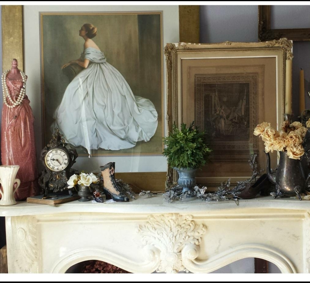
and another before…
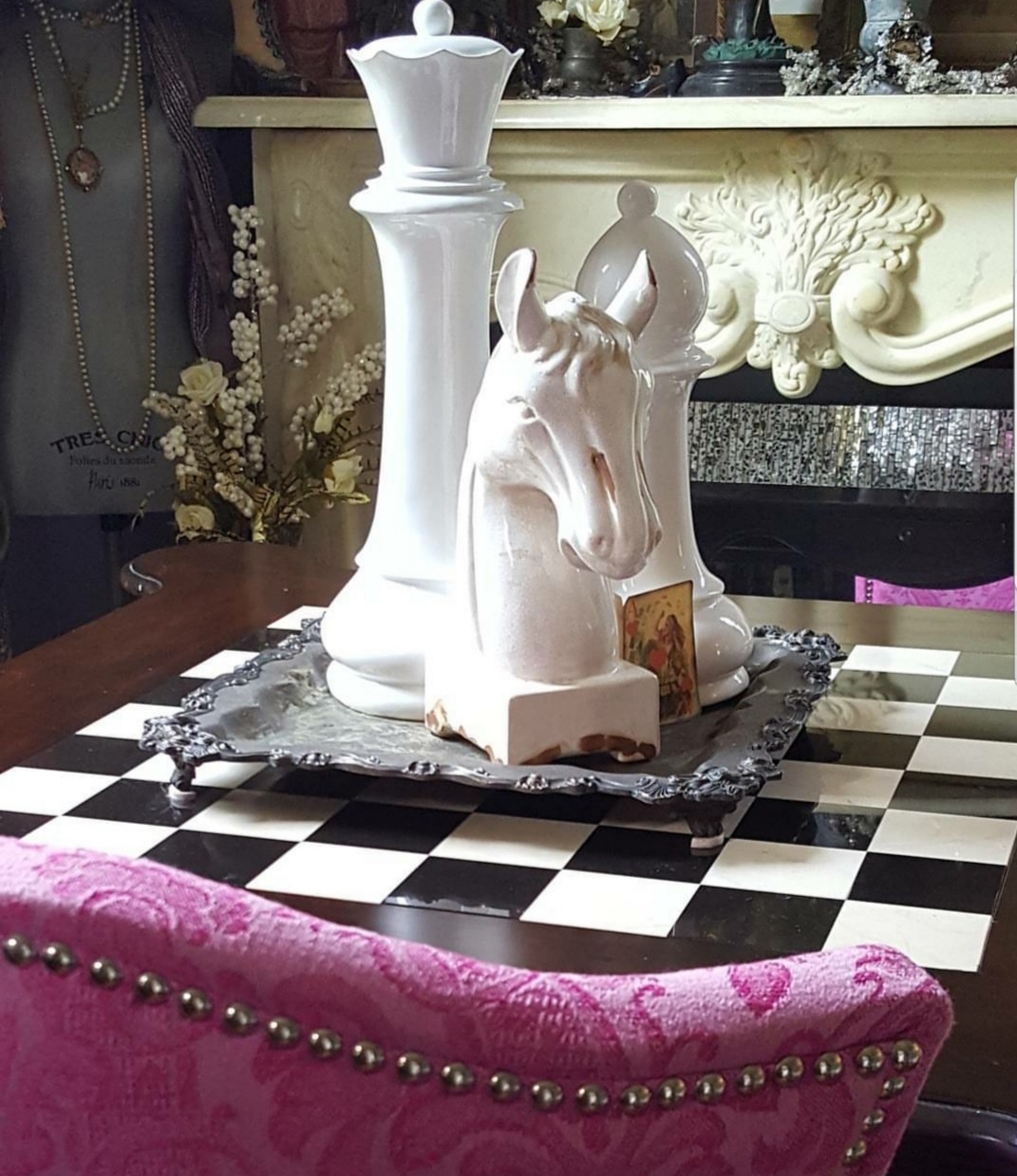
Again, these pics show it during the earlier days before it got all cluttered up. As time went on it became my Decor Storage/Hoarding room and was never used. Do you have a room like that? Throw whatever you bought inside and shut the door. I may have done that A LOT! Well I decided to take the room back and create the ultimate office, music and craft room…a.k.a. the Urban Chic She Den.
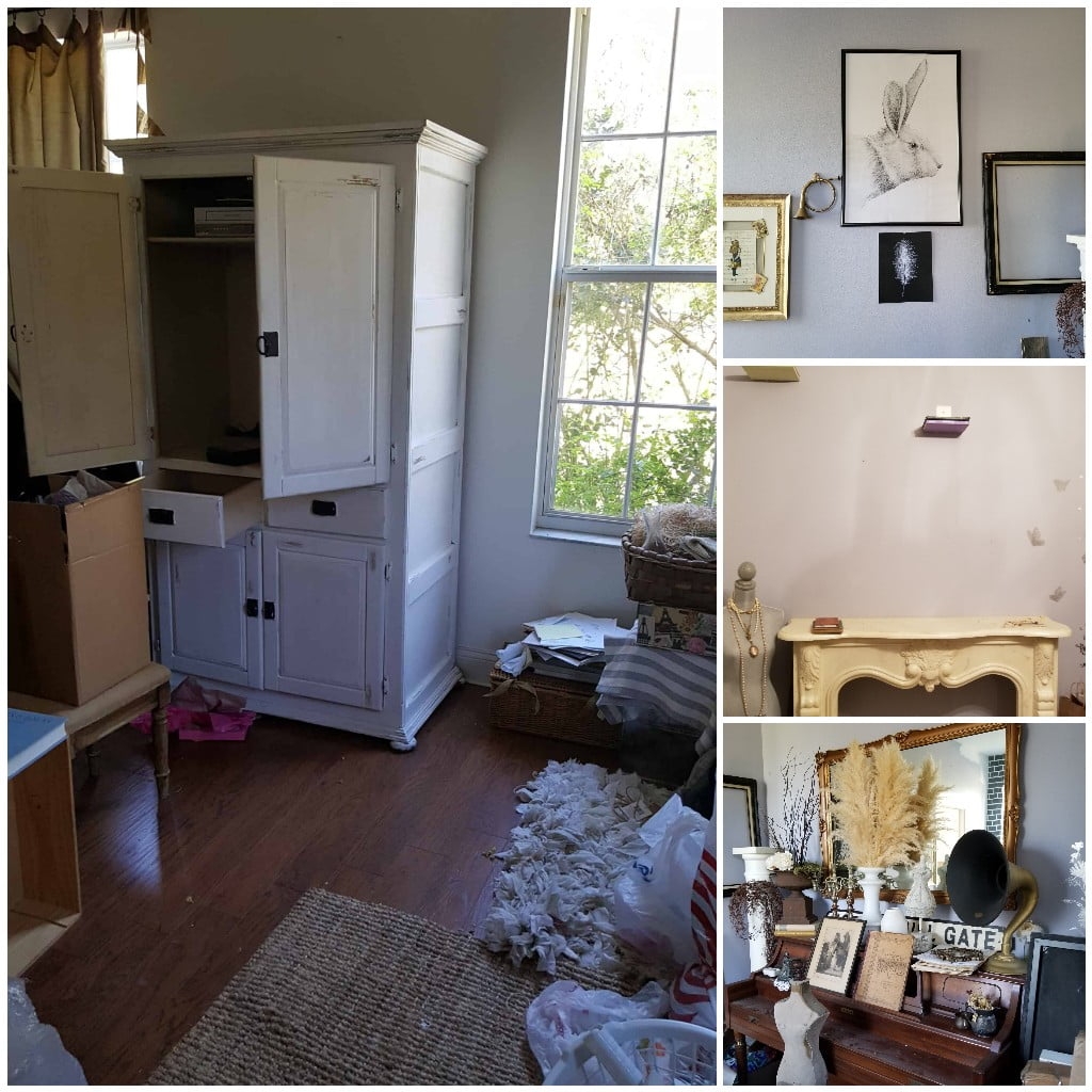
Here are the mandatory UGLY BEFORE pics, showing the true state of chaos it was in when we started. It was cluttered and so full you could barely walk inside. See bottom right corner pic and triple that. This is the state of the room as we were cleaning it out to make it beautiful! But you get the idea…purple gray walls, dark curtains, lots of stuff!
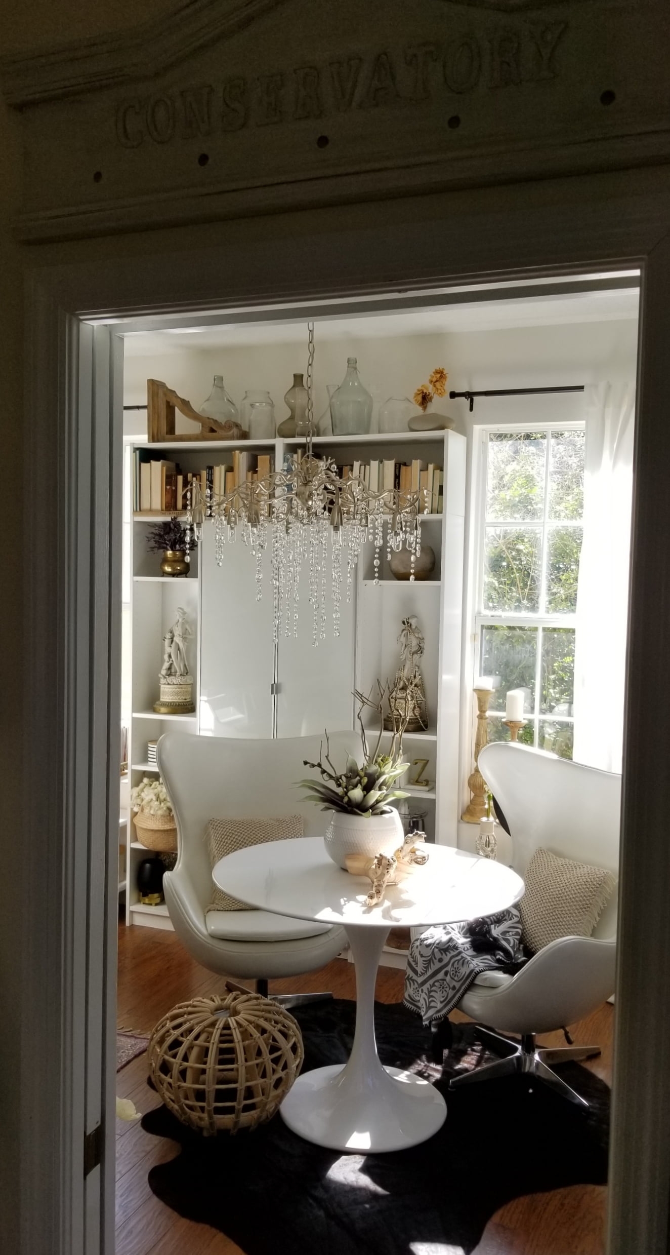
If you’ve been following along each week and taking notes as to which items you think I chose, now is the time to compare and see how you did! Let’s see how well you know me! Here is the space NOW!!! Ta-Da!!
This post has sponsors and affiliate links have been used, but all opinions are my own!
Isn’t she pretty??? Oh, how this room makes me smile now!!!
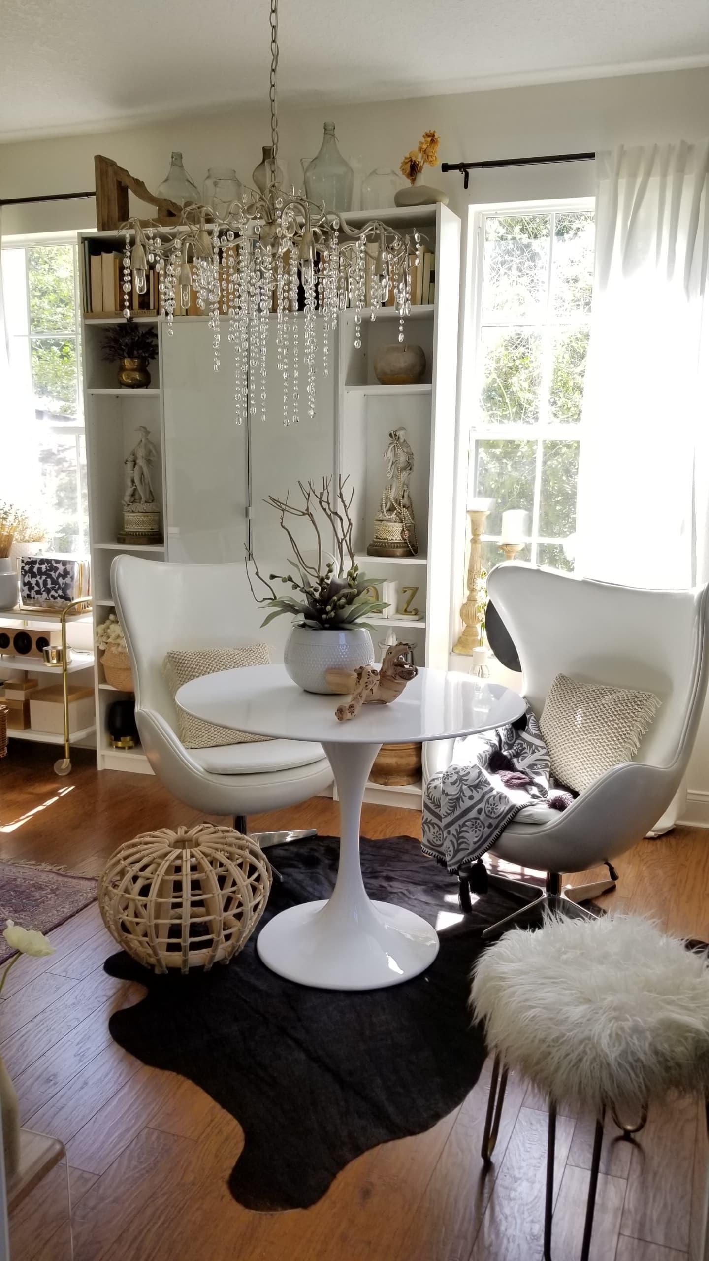
The first thing to go was the giant, outdated armoire. In its place came this beautiful sleek shelving unit from Ikea. We customized it to fit the space perfectly. Love the glass doors.
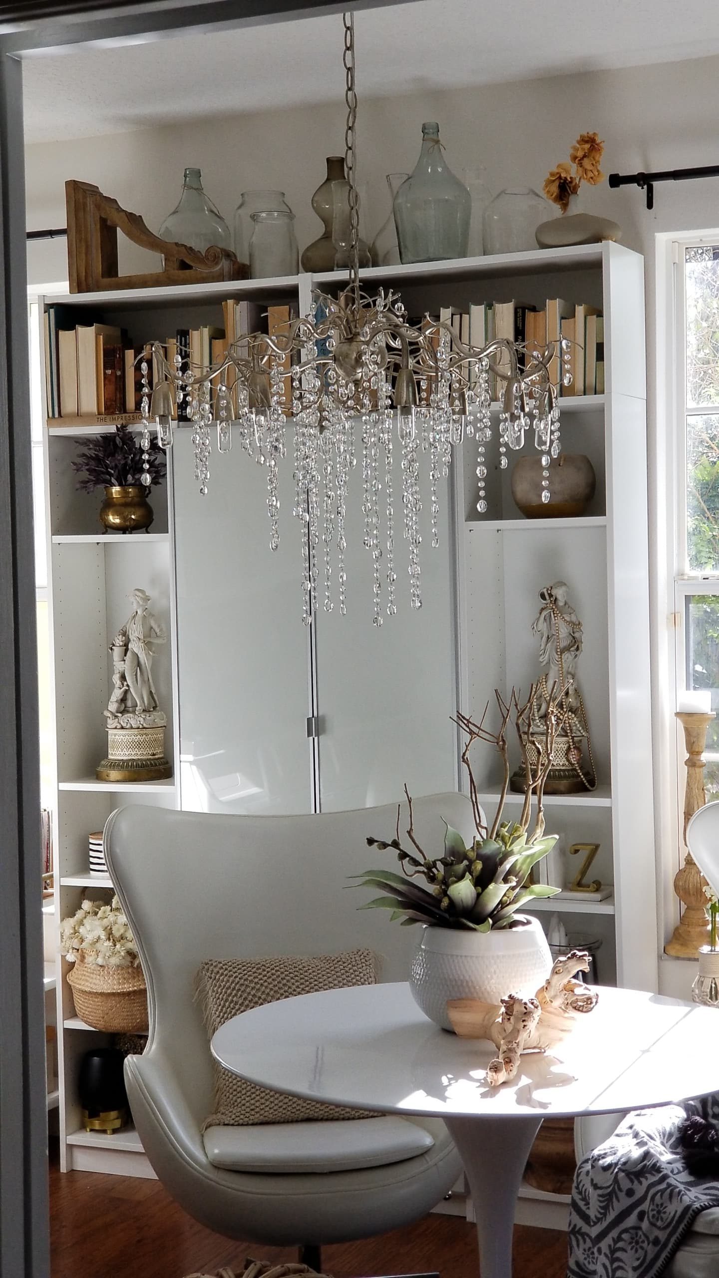
This room will still have to store a lot of my decor pieces that I will use for product styling, room designs, and even clients. But now I can conceal some and leave others on display until I need them…and they look good in the process! Whether it’s old books, vases or glass bottles these pieces are doing double duty now.
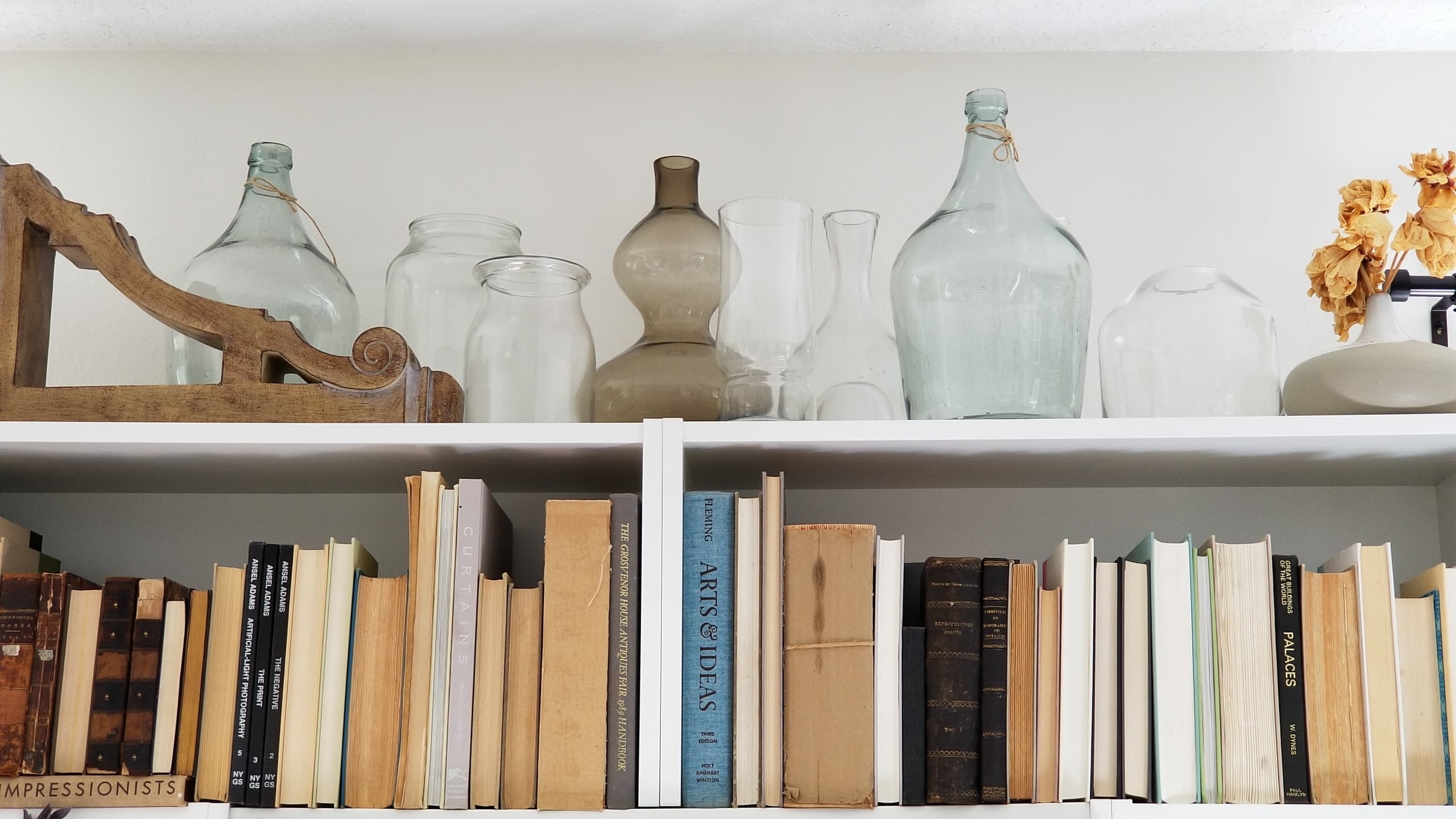
Organized AND Stylish
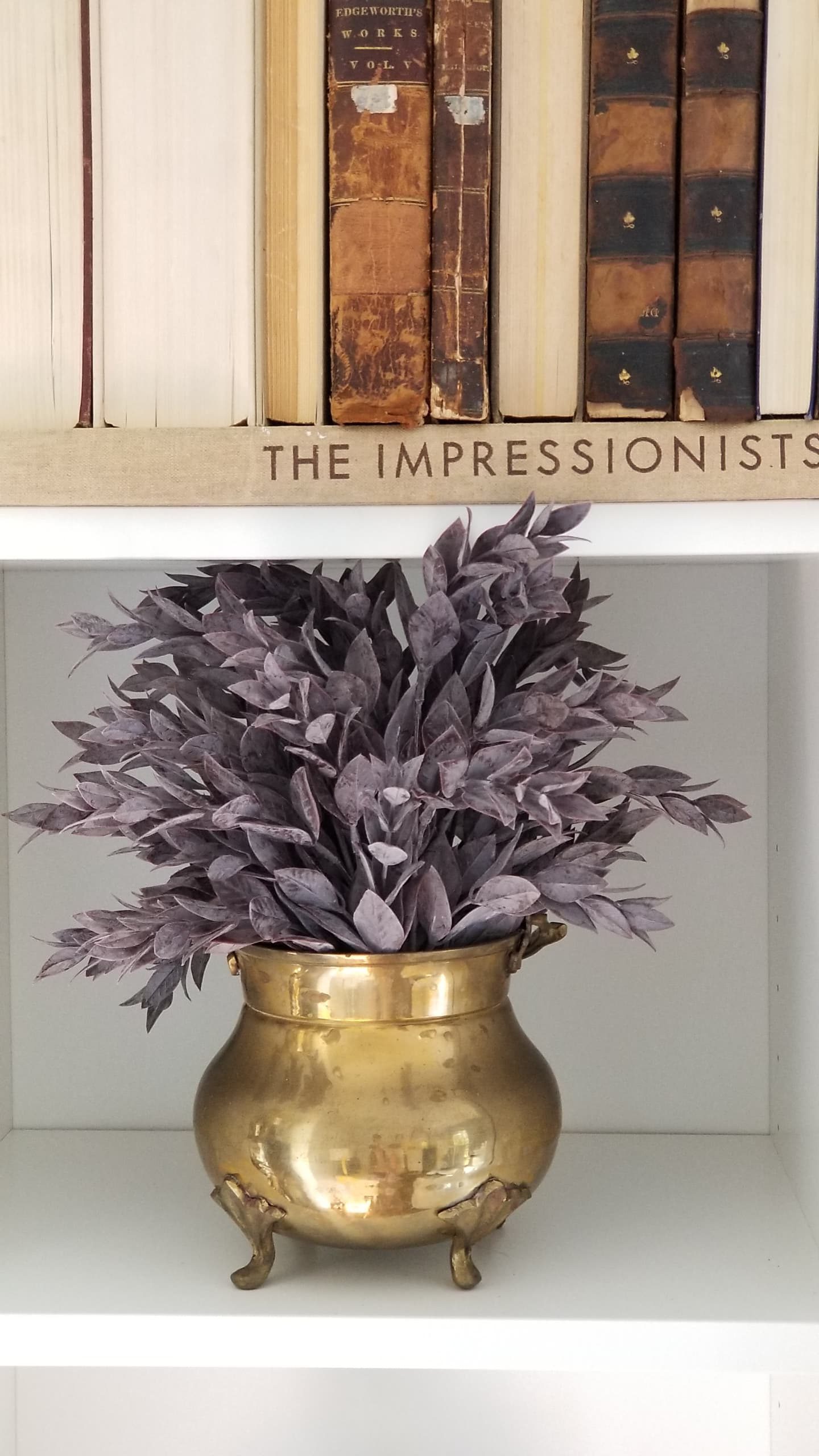
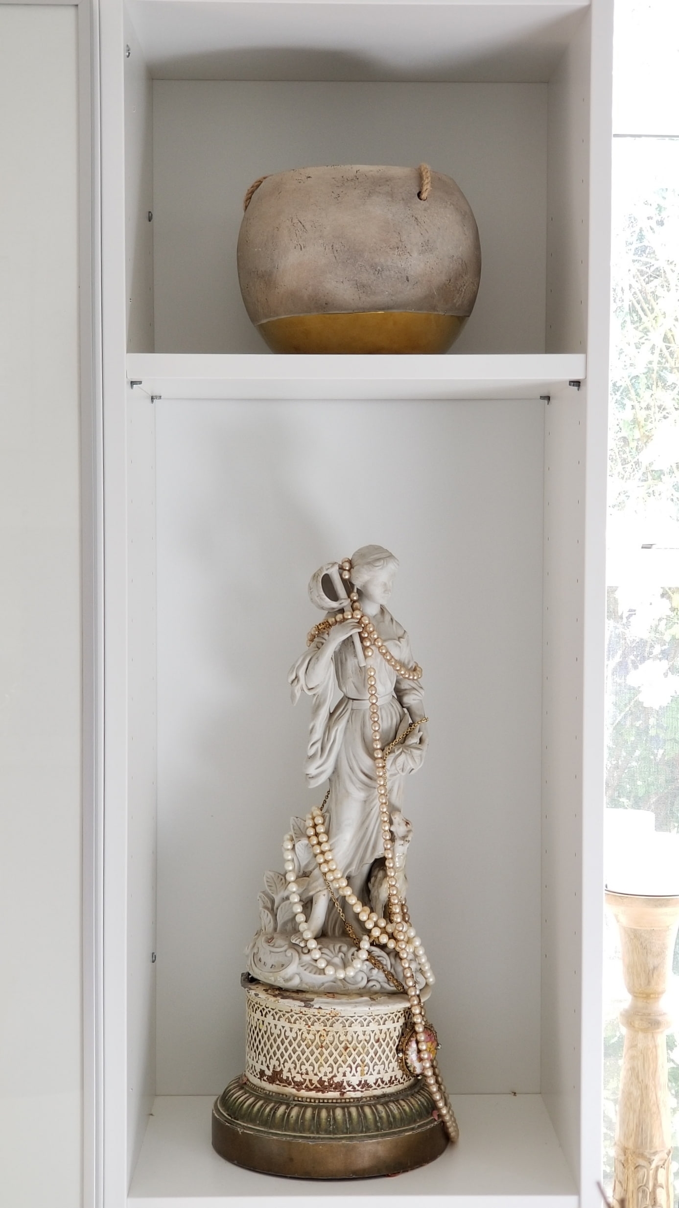
I was able to finally display some sentimental pieces like this one from my Grandmother. It was actually a table lamp and I removed all the lamp parts because they were damaged. This piece means so much and seeing it every day is so special.
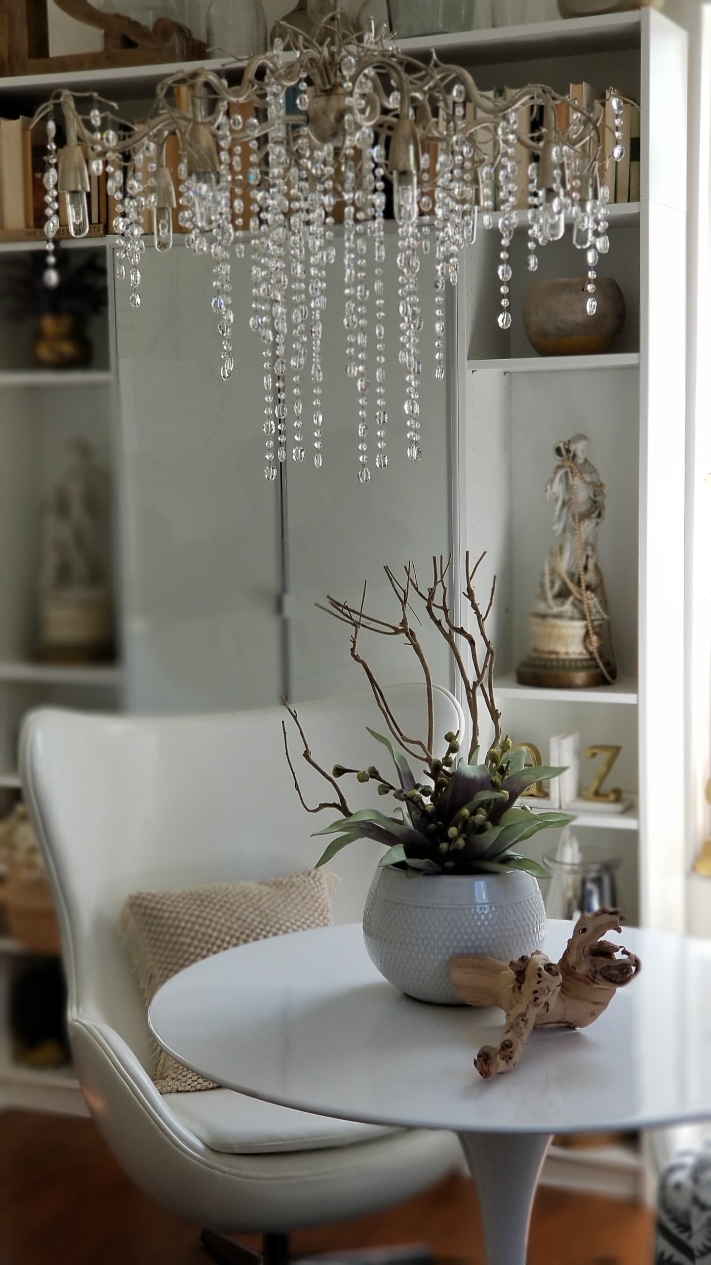
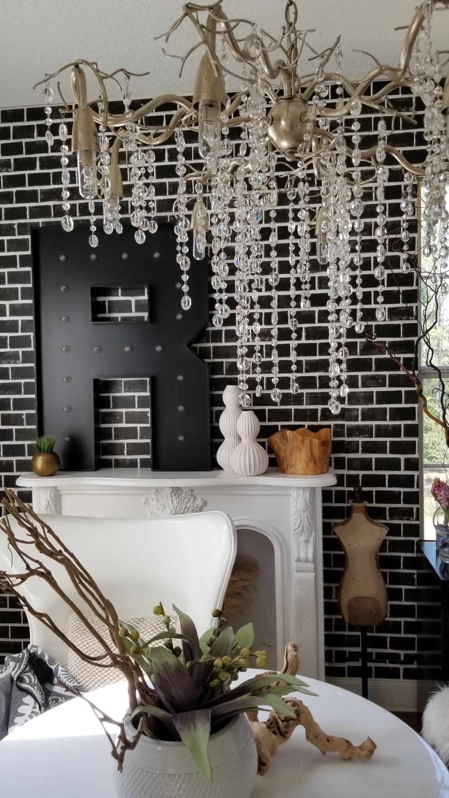
This room has the best natural light in it due to the 3 large windows, and living in the country the views aren’t so bad either. 😉 This Chandelier from Lamps Plus was the perfect statement piece.
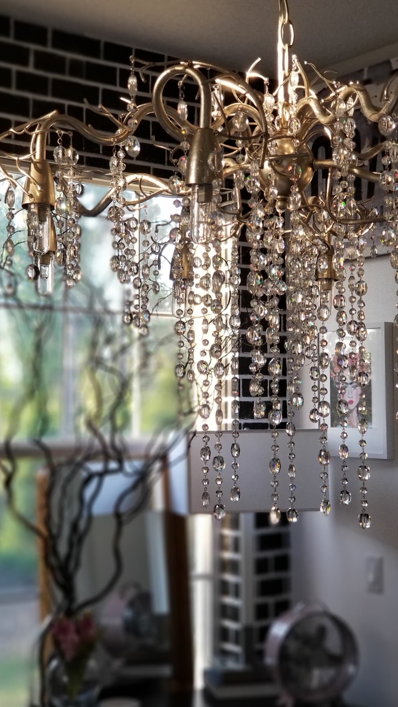
It shines like a disco ball when the sun hits it and it while it’s large, it’s airy and gives the room the chic look I wanted.
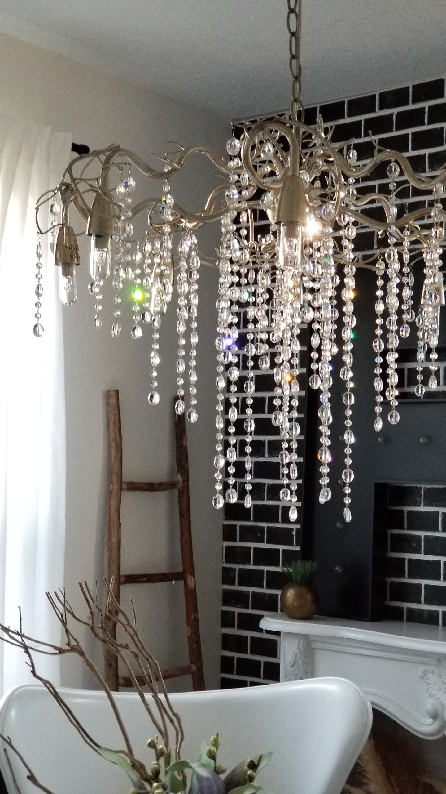
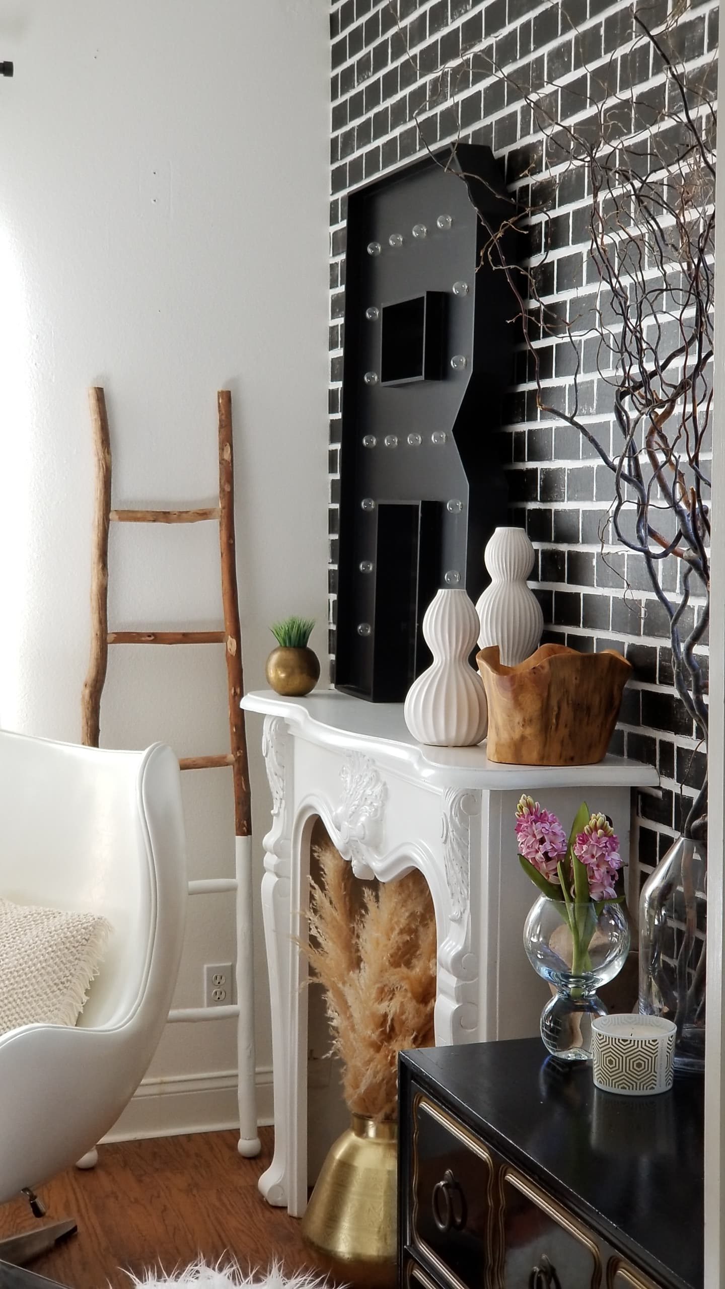
I shared earlier in the challenge that I would be adding wallpaper to the space. Do you see it peeking through? This black brick paper from Milton & King Wallpapers was the perfect paper for this room.
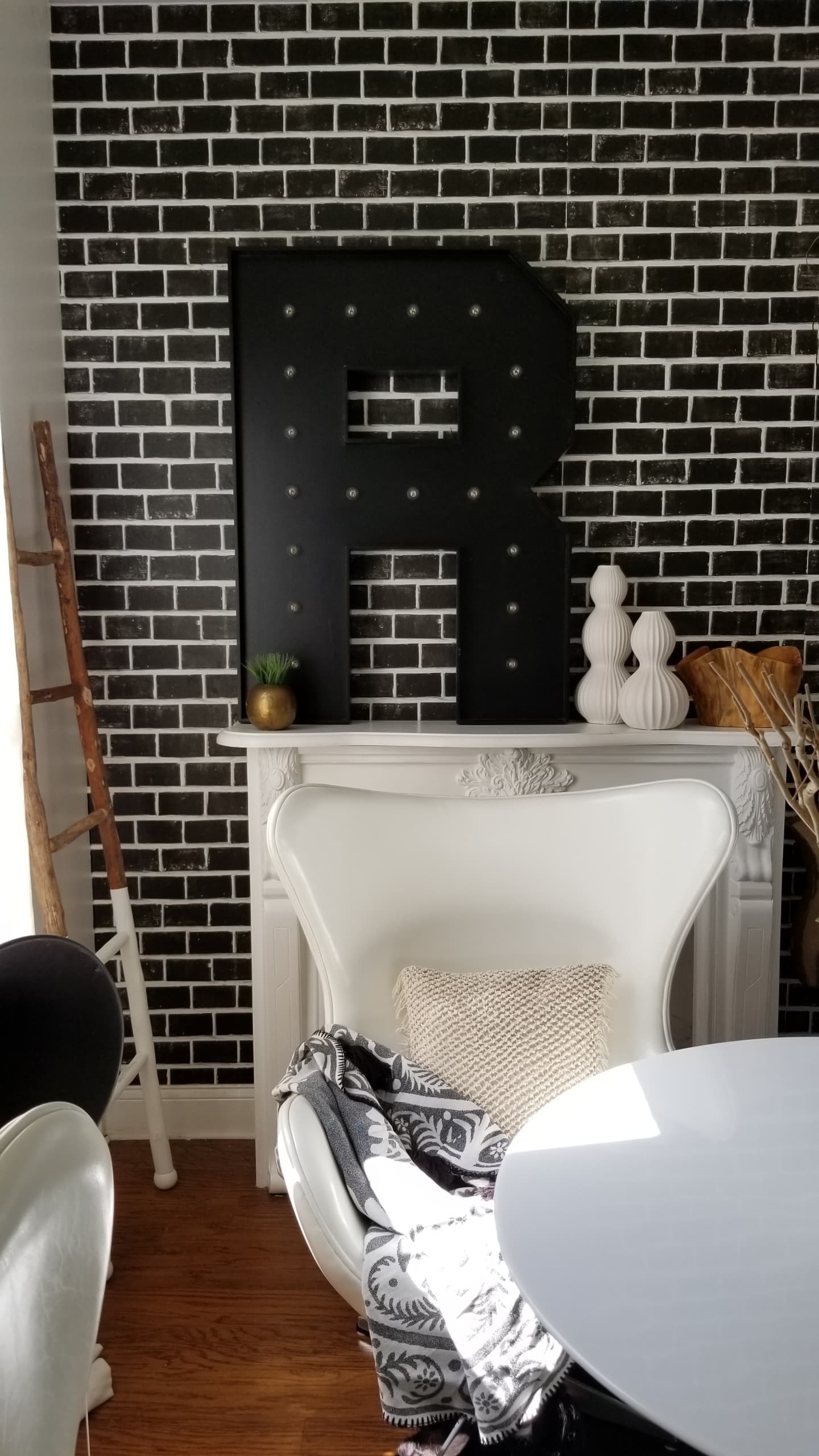
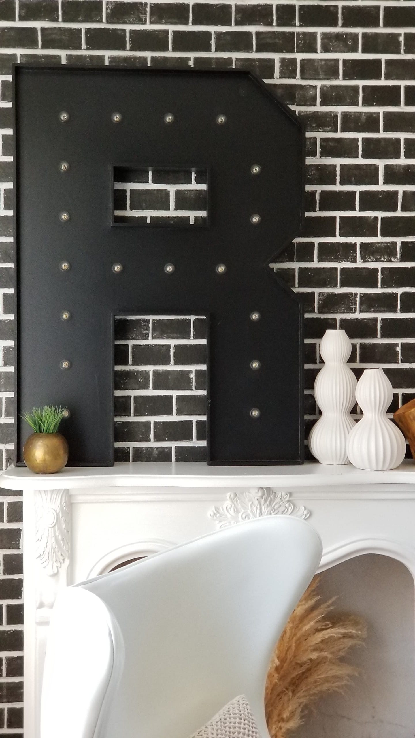
Brick has such a timeless style. Black brick to me is even cooler and adds just the touch of “Urban” drama and interest I wanted here. What do you think?
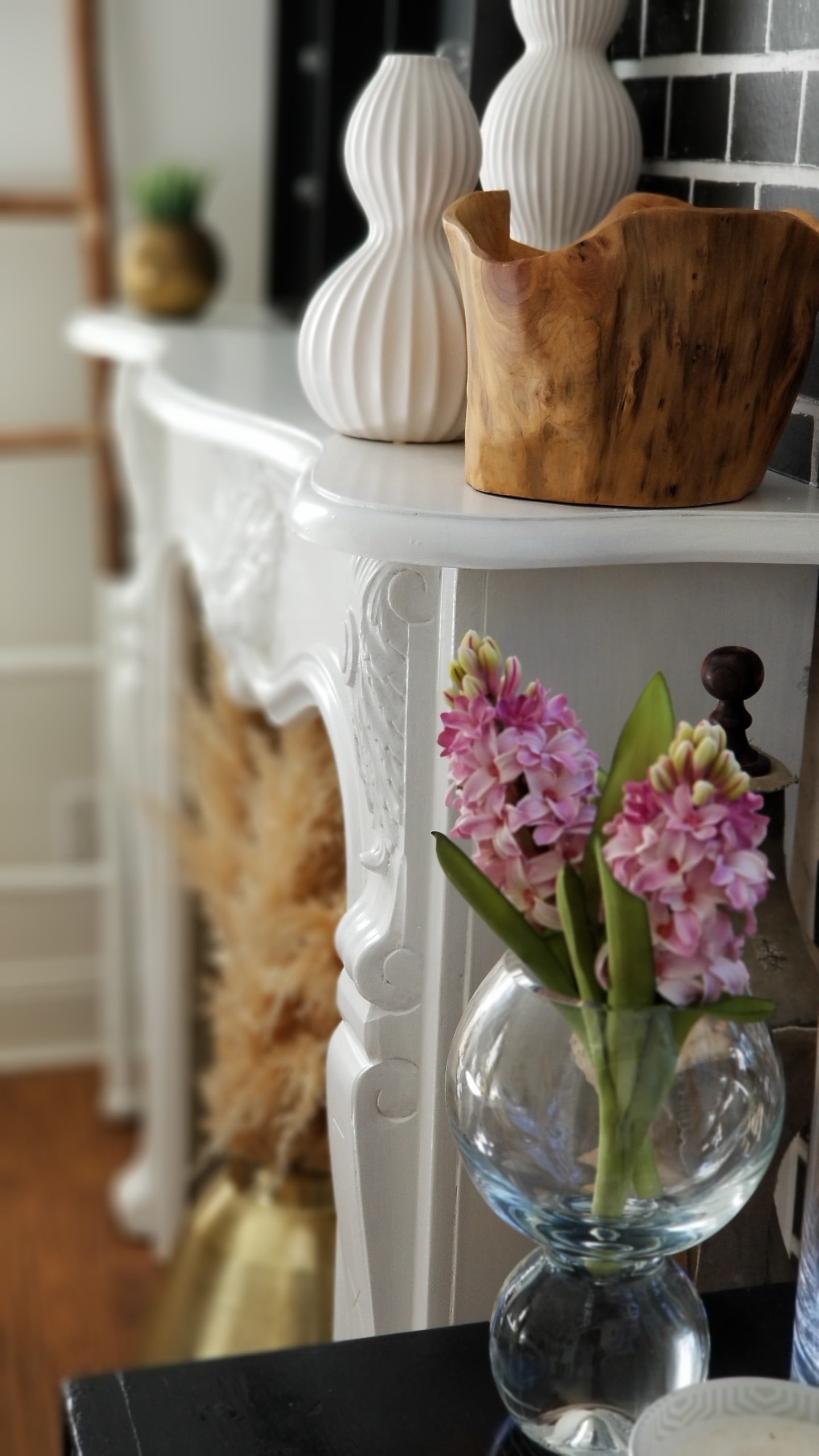
The mantel was a hand-carved marble piece that I bought from one of my favorite local shops, The Eclectic Market. While it was gorgeous, it had a very yellow undertone. I wanted to paint it white but couldn’t find any tips on how to do it, or if it could be done. Well, I took a chance and did it. DIY to follow. 🙂 I think it looks amazing, especially against the black.
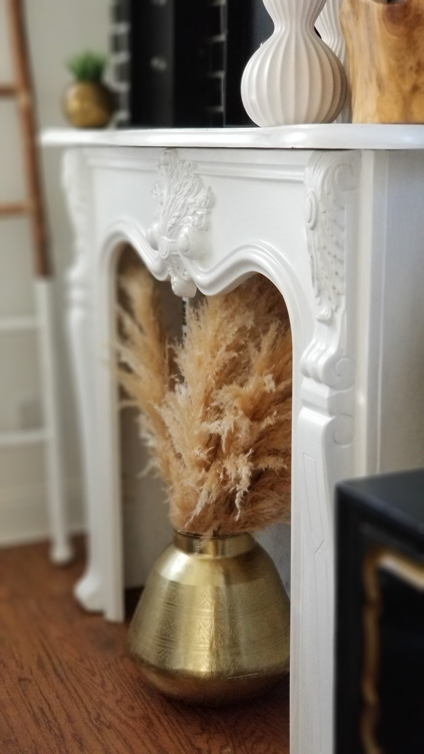
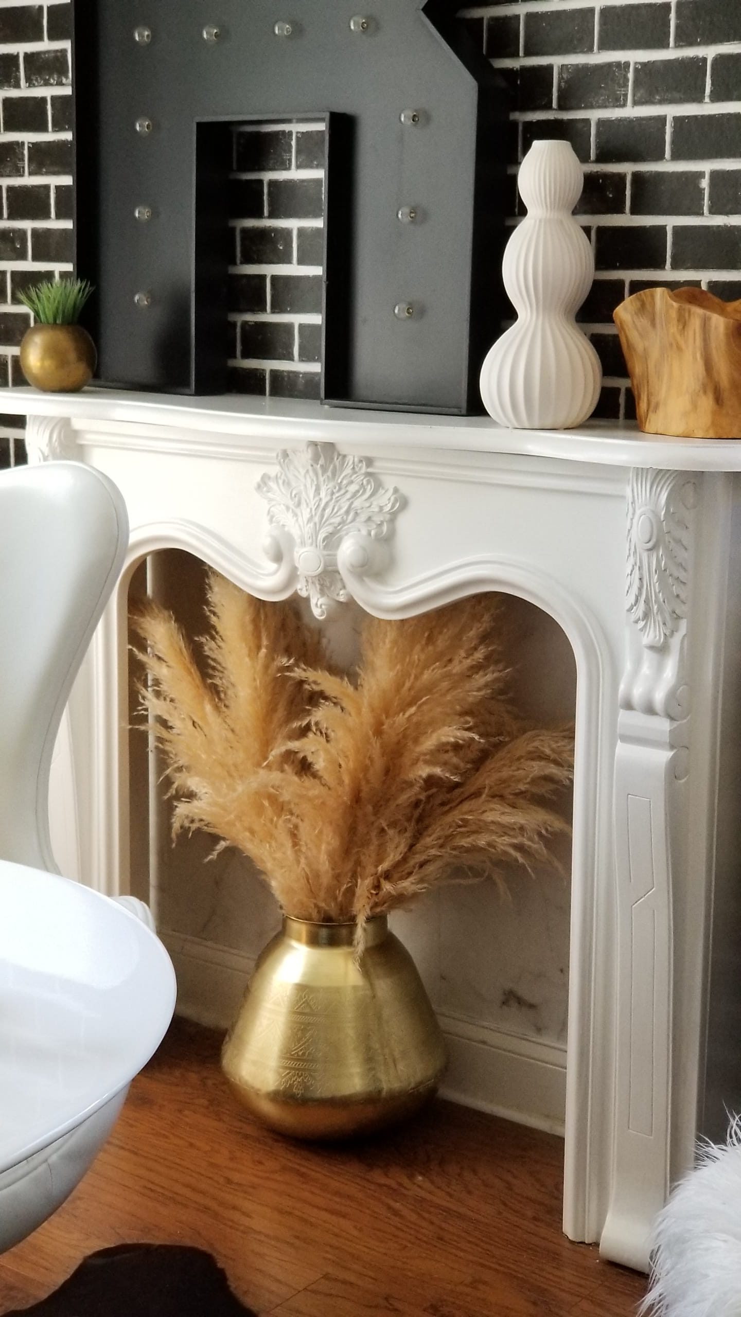
Don’t worry the mantel wasn’t an antique and you can still see the marble veins peeking through. To add to the marble look, I added some white marble wallpaper also from Milton & King to the back of the wall. It came out just the way I wanted. If you are considering wallpapering a space in your home…do it! I have used Milton & King papers in a few areas of my home and I’m always thrilled with the results. In fact, I tried some peel and stick paper from the store the other day and I honestly gave up. The real stuff is so much easier to apply!
Remember the Dorothy Draper chest I shared back in Week 4. I mentioned that I had one from my Grandmother that I cherished and of course I had to work it into the space. Not only does it go great in the room, but it gives me lots of storage for paperwork and office supplies.
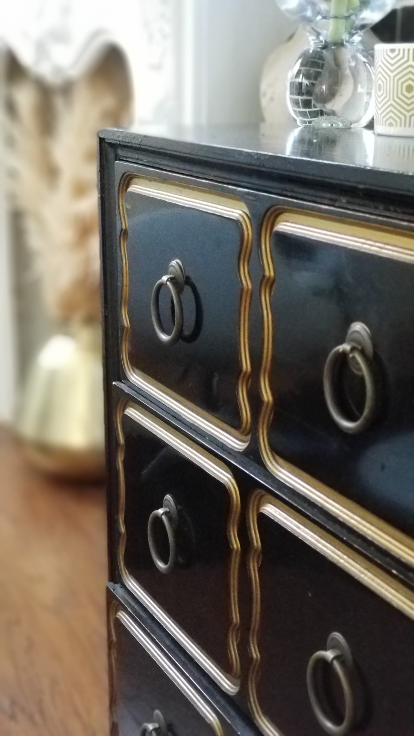
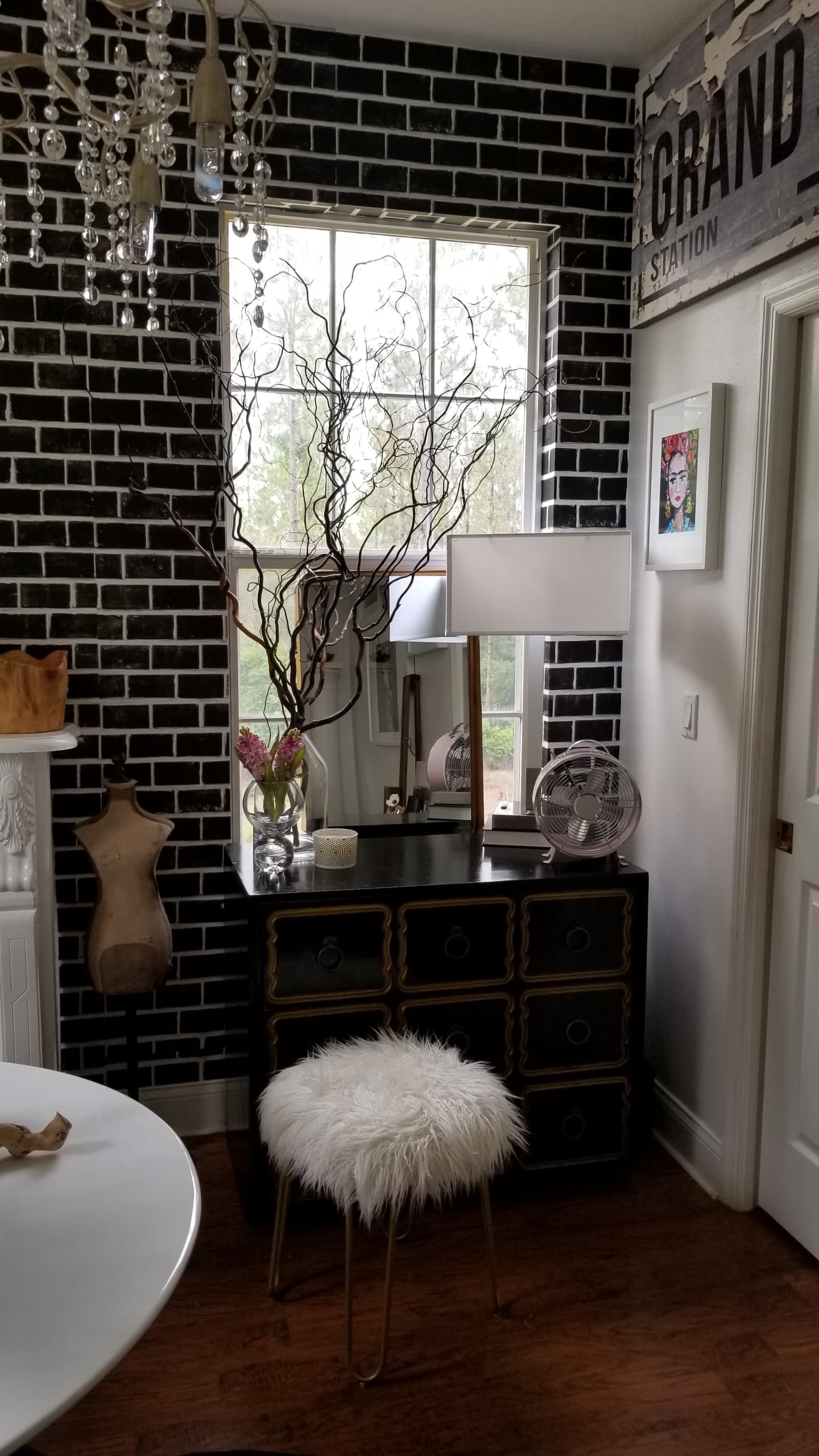
It’s nice to get new pieces, but the vintage ones and especially sentimental ones steal my heart! 🙂
Instead of adding a curtain panel on this window I added this beautiful gold mirror from Joss & Main. I love the reflection it gives the room and the little bit of interest it adds to this corner.
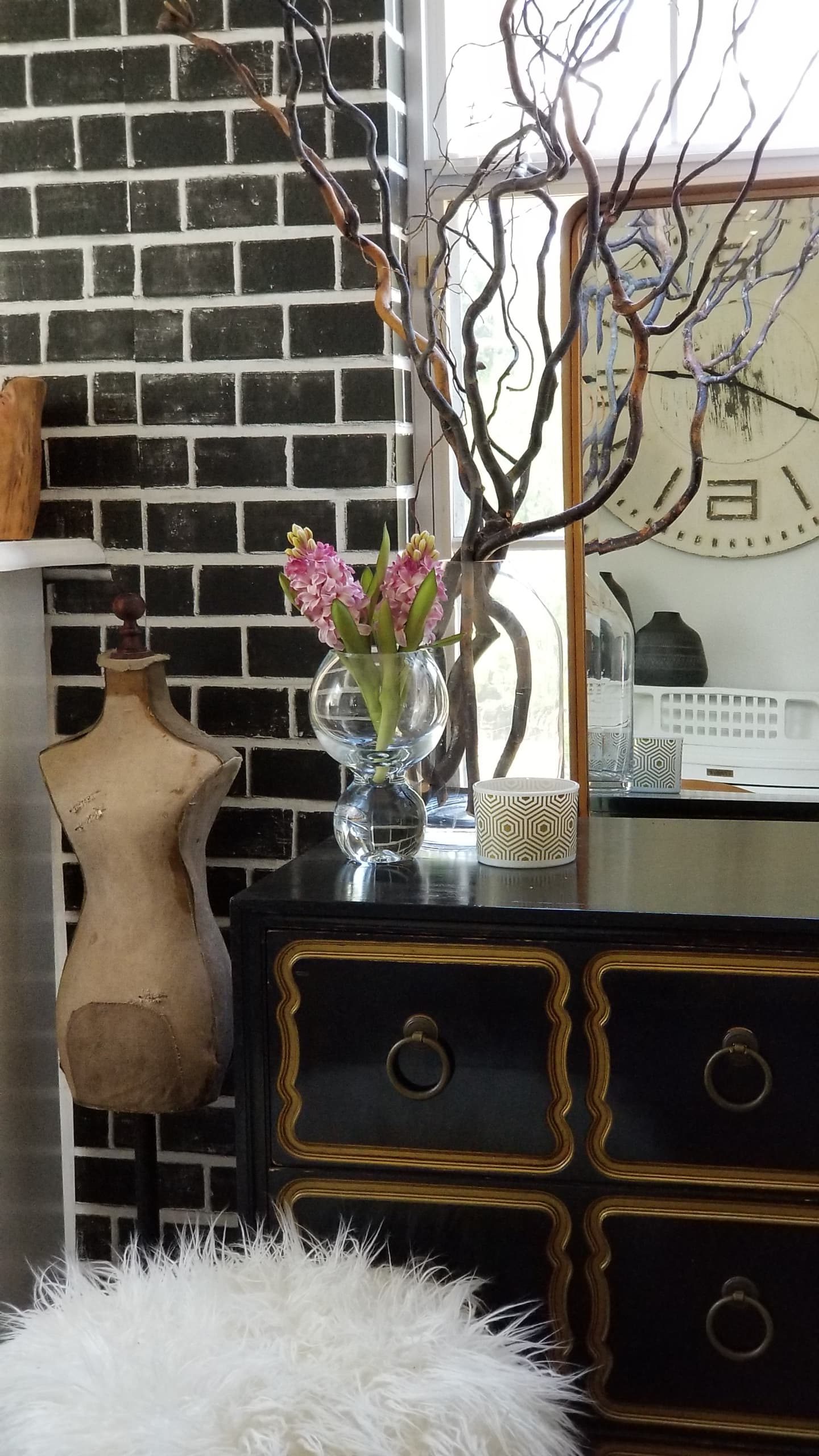
I really wanted this room to reflect all the things I love. I wanted it light and bright, yet dramatic and edgy. I wanted lots of natural woods, modern pieces along with vintage decor. I also wanted it to reflect my creative side with a true gallery wall of art. Since this is the “girls” room I wanted it to have a fun, feminine side.
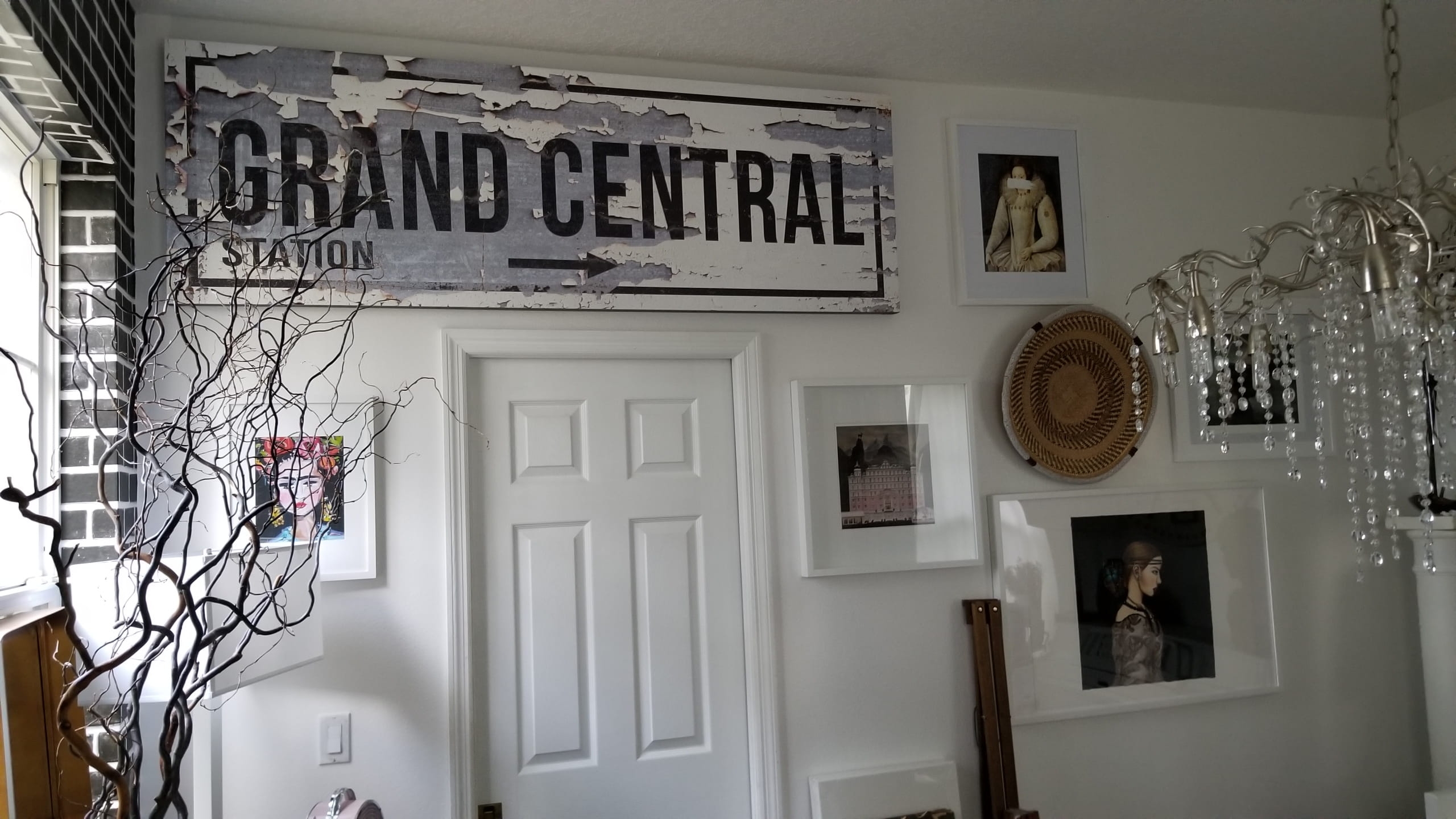
I filled this wall with art, decor, and pieces that just make me happy. The outrageous sign from Walls of Wisdom makes me smile because it’s a nod to my NY roots and screams industrial. Isn’t it amazing??? It’s the perfect piece for this room!!! The sweet Frida artwork is from one of my favorites Maren Devine Art. Her artwork makes me smile!
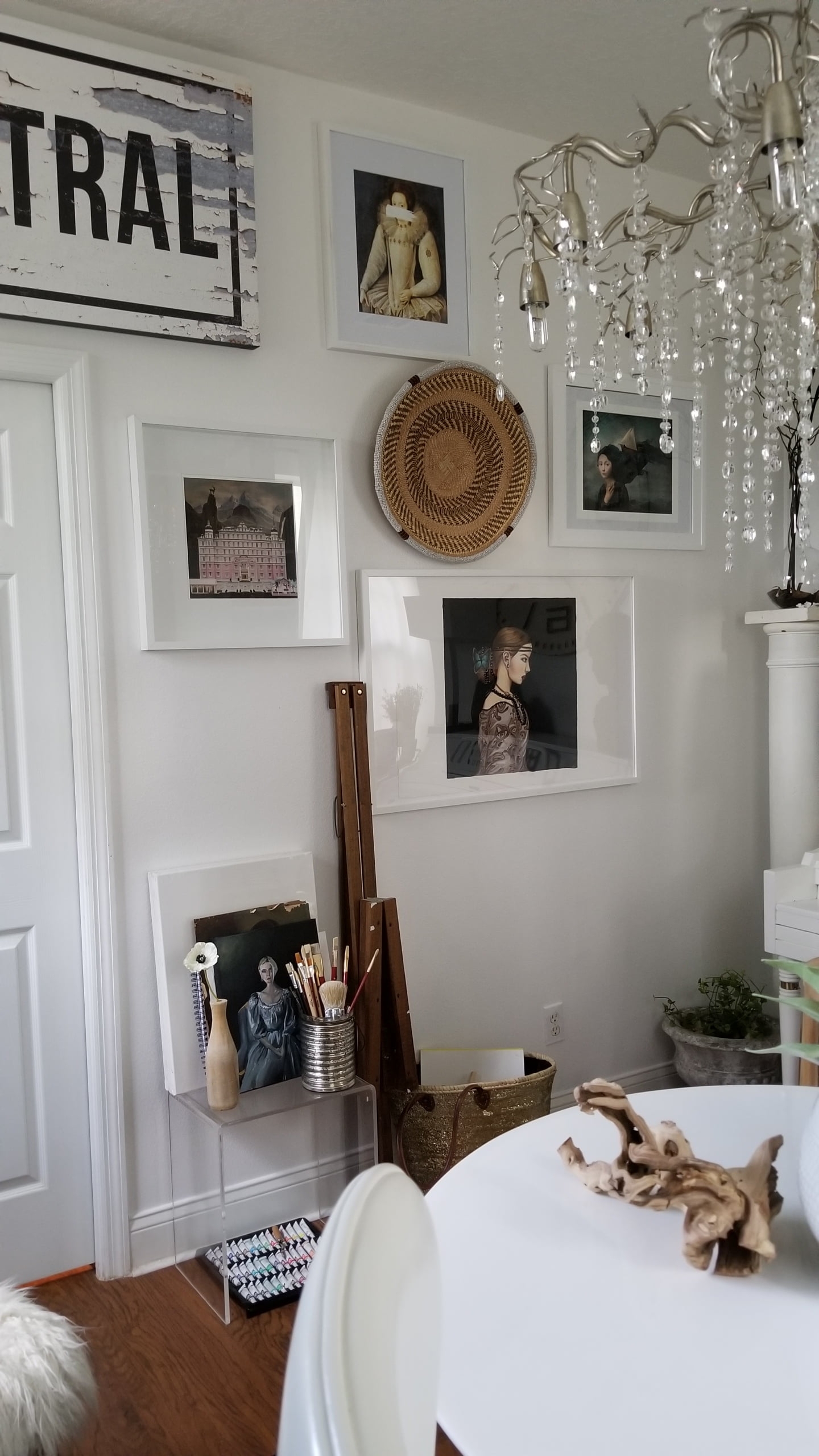
The basket from Suzanne & Zondi is handcrafted and beautiful in every way, adding the perfect amount of texture. If you’re looking for a true statement piece I highly suggest you check out her products.
I chose additional artwork that was whimsical and colorful. I also created a small space to paint when the mood strikes. I have this cool vintage easel that just folds up when not in use and leaning against the wall.
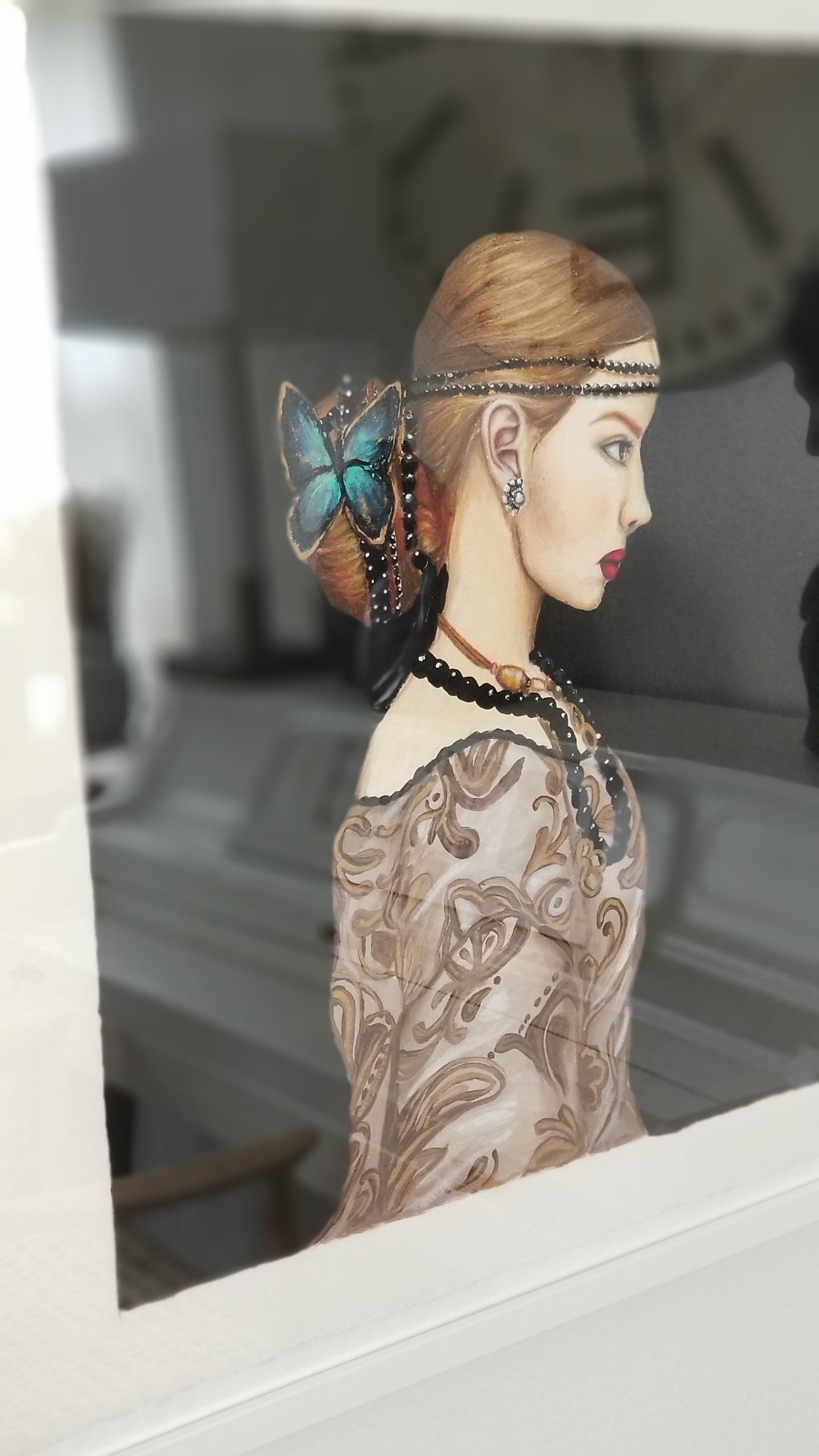
While I love all the art in this room, this piece is extremely special because it was done by my teenage daughter. She amazes me. You can see more of her art on her Instagram at WallflowerWorkshop.
I did mention that this would be a music room too, remember? We had a piano in here, but it wasn’t pretty. Again, it wasn’t an antique but it did the job. I decided to go ahead and paint it. While it took some time, I love how it turned out! Another DIY tutorial to follow! 🙂
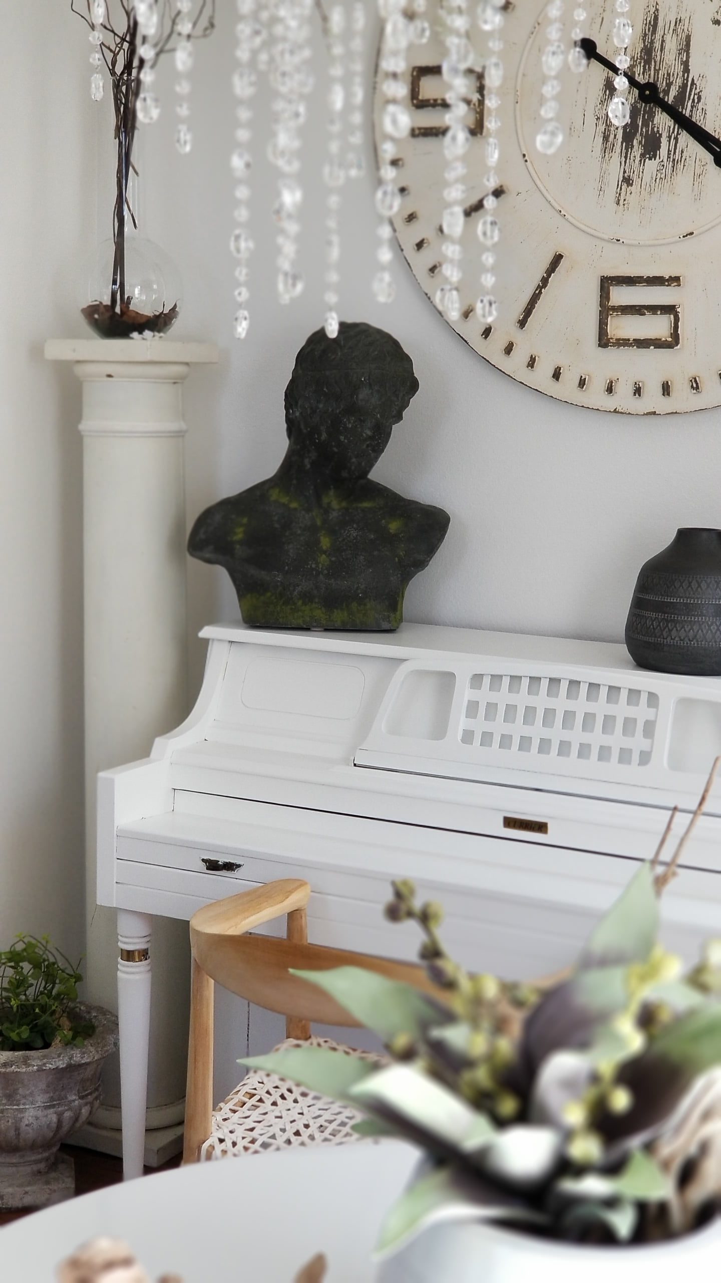
My friend gave me some Dixie Belle Chalk Paint to use. I loved it!!! Went on so smoothly and their white is a nice bright white! She will be offering a discount on this paint to all my readers, so if you would like to try it head over to her Instagram page at The Eclectic Market.
Paint makes such a difference, whether on the walls or on furniture. Of course, adding the right accessories and furniture can make or break a space! I was so thrilled to work with some of my favorite shops for these pieces.
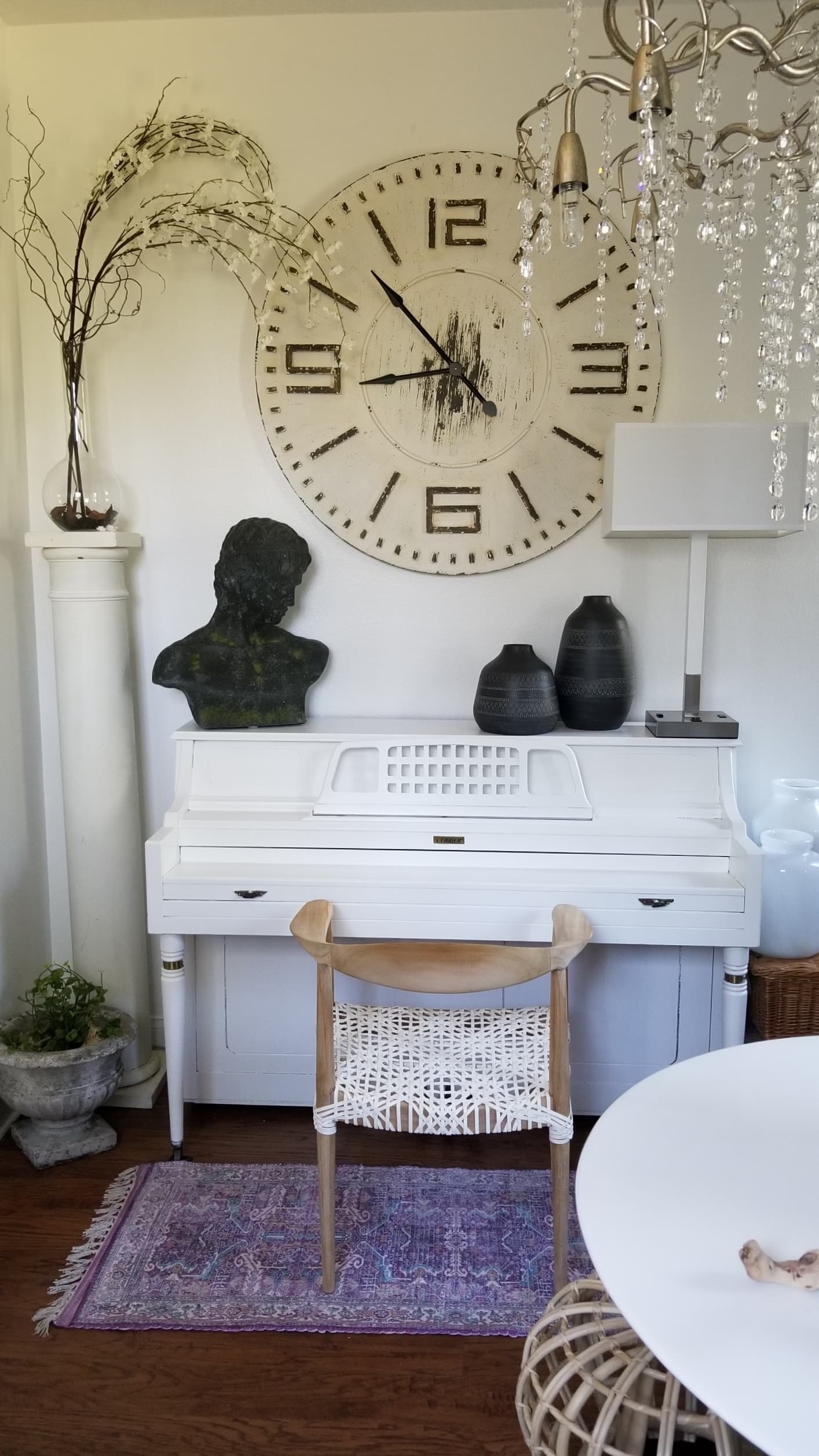
This huge clock from Joss & Main added a touch of rustic and was the perfect statement piece for this wall. While the lamp from Lamps Plus and gorgeous teak chair from Bed Bath & Beyond added the modern touch I love!!! Again, I wanted to add lots of textures…glass, wood, stone and ceramics and don’t forget the florals. My friends at Afloral helped me with a lot of the florals you see here!
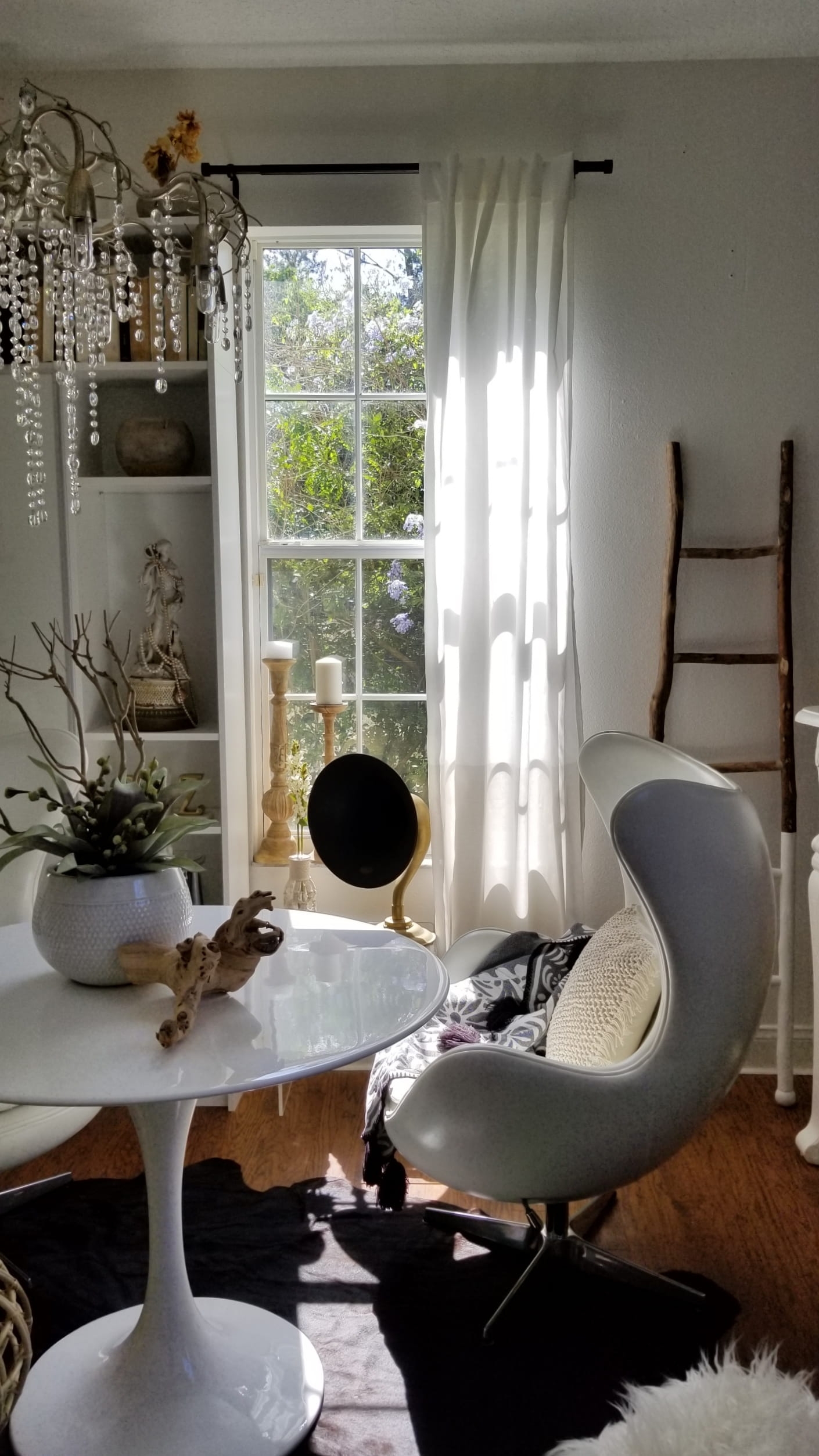
I tried to add elements from all the styles I love. Even this funky black cowhide rug from Rugs USA makes me smile. It isn’t as big as others I’ve gotten which worked so well in this room. I didn’t want the rug to swallow up the space, just complement it.
While I dreamt of a rolling library ladder in this room there just wasn’t enough space. The funky white painted ladder from Joss & Main filled the void. 🙂
By swapping out the darker curtain panels for these lighter ones from Bed Bath & Beyond, the whole room was brighter. They actually have a shaded bottom half that’s very subtle, yet very elegant.
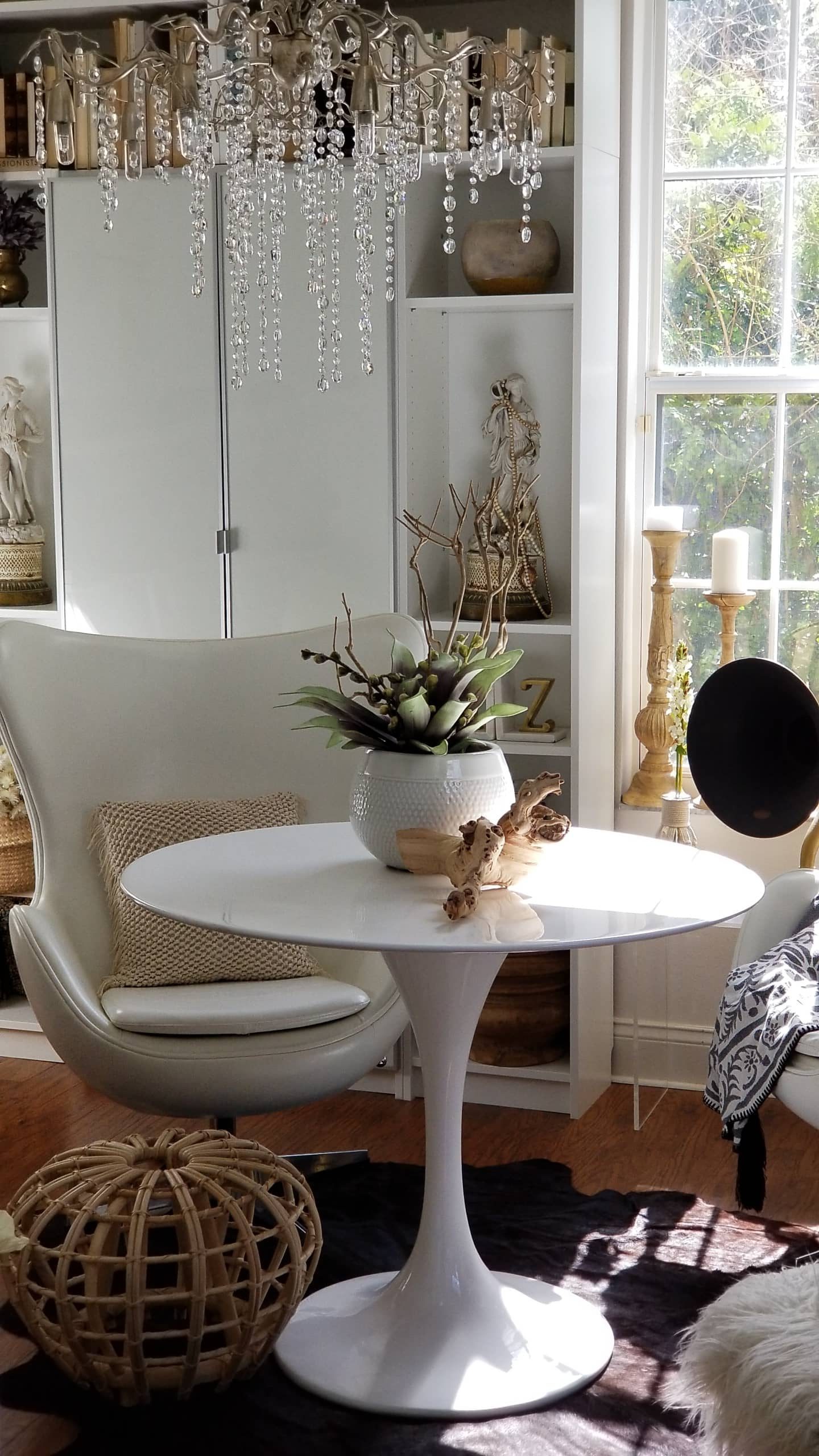
Let’s talk about the elephant in the room though …the White Table and Leather Egg Chairs from Bed Bath & Beyond were made for this space. Before I had a square table and it never looked right. This round set up was the way to go and aside from being gorgeous, it’s all extremely comfortable. My laptop finally has a home and the kids are welcome to join me here as long as they don’t make a mess! 😉
I can’t tell you how excited I am to walk into this room now. It’s everything I hoped for and more. So if you were guessing at what I was going to choose…how did you do? What’s your favorite part? I’d love to hear from you in the comments below. I’m happy to have another useful and beautiful space! You don’t have to have a large budget to make a difference either. Remember:
- Paint can make a huge impact on walls and furniture.
- Shop your home for pieces you can repurpose.
- Add a few new key items.
- Collect and include some vintage pieces for character and interest, family heirlooms are the best!
I have more posts to come with some of the DIY’s I did in this room as well as some tips I learned along the way.
A HUGE Thank You to my incredible sponsors on this project, Bed Bath & Beyond, Lamps Plus, Rugs USA , Joss & Main and Milton & King. I couldn’t have done it without you! Also a Big Thank You to the small shops and artists that allowed me to share their talents with you! Please check them all out!!!
I can’t forget my awesome family that helped me all along the way and put up with weeks of one mess after another! Thank you, thank you! 🙂
I hope you follow along with me on Instagram, Pinterest, Facebook and here on the Blog to see more photos of this new space and the DIY’s I did! Be sure to see what all the other Guest Participants are doing as well by visiting the One Room Challenge official site.
As promised here are a number of the products I shared in the space. 🙂 If there is something else you would like info on, just write in the comments below or send me an email!
Product Sources and Links:
Thank you so much for joining me!!!
See You Soon!!!

 Shop The House Design Challenge – Fall Edition, Week 2
 Kitchen Makeover One Room Challenge Update, Week 3
 Got Avocados? Easy and Healthy Summer Lunch Idea

I love it!! Especially the egg chairs!!
They are the comfiest chairs ever!! Thank you Shannon!!!!
Wow Holli, you have out done yourself once again. I love everything about you new space and it’s so much brighter and inviting then ever before🙌
It’s my favorite room now!! So happy you like it!!! Come over soon!
What a fantastic room! I especially love the brick wallpaper, the chairs and that chandelier! Gorgeous!
Thank you so much!!! You picked all my favorites!!!
so pretty, holli! i love how you mix styles!
Thx so much Cassie!!! I love how this room feels now!!!
Holli! You did an amazing job. This space looks like a magazine feature, or should be! You did such a beautiful transformation and I love how yo style those shelves!
Laura that is the best compliment I could get!!! Thank you so much!!! Another ORC down!! Yay!
Holli, this space looks amazing! It is truly a “transformation” and I love that it’s so “you.” You nailed the boho-chic-vintage thing so perfectly – you are SO good at mixing styles and trends!! Congrats to you on a job well done!
Sheila
xo
Thank you Sheila SO much!!! It means alot bc you know how hard these projects can be!! So happy to be a fellow participant with you! ❤ Congrats to you as well!
Wow, what a beautiful space you have created!! I loved reading about the process! I have a room that I want to turn into a studio for me! Thanks so much for the inspiration 💗😊
Amber @culdesac_cottage
Thanks so much Amber! I love having this space to work in and relax! Have fun with yours!!
What is the black, round object in many of the pictures. It’s quite distracting in that I’m courious what it is!!!
Hi, that is actually a vintage speaker. Pretty cool piece. Like from a Vitrola.
I love the chandelier, but I really like the french style mantel. Did you re purpose the mantel or did you purchase from a store?
Thank you. I got that mantel from an antique store. I love it too.