Creating The Perfect Space with Decor, Tones and, Textures
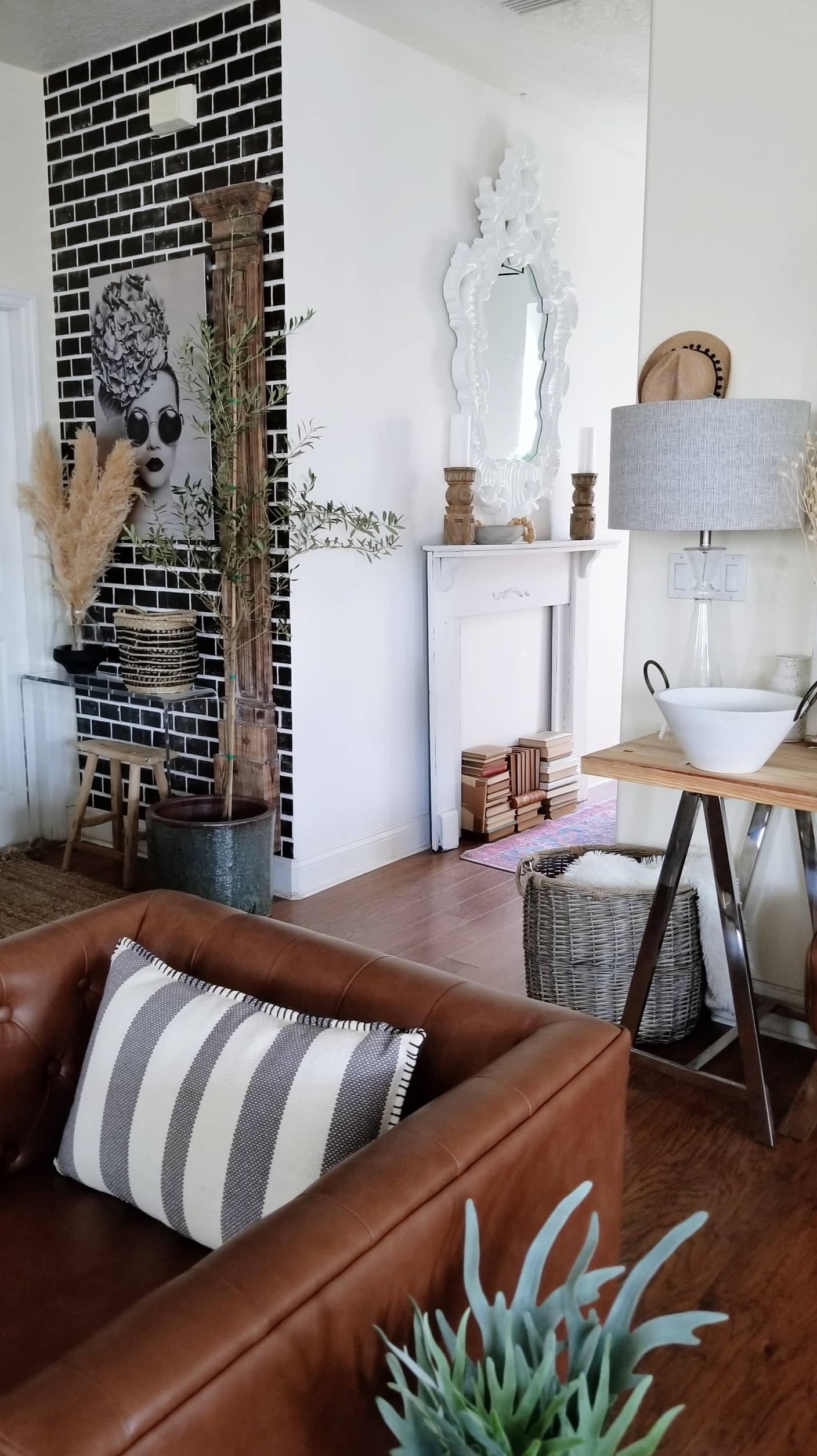
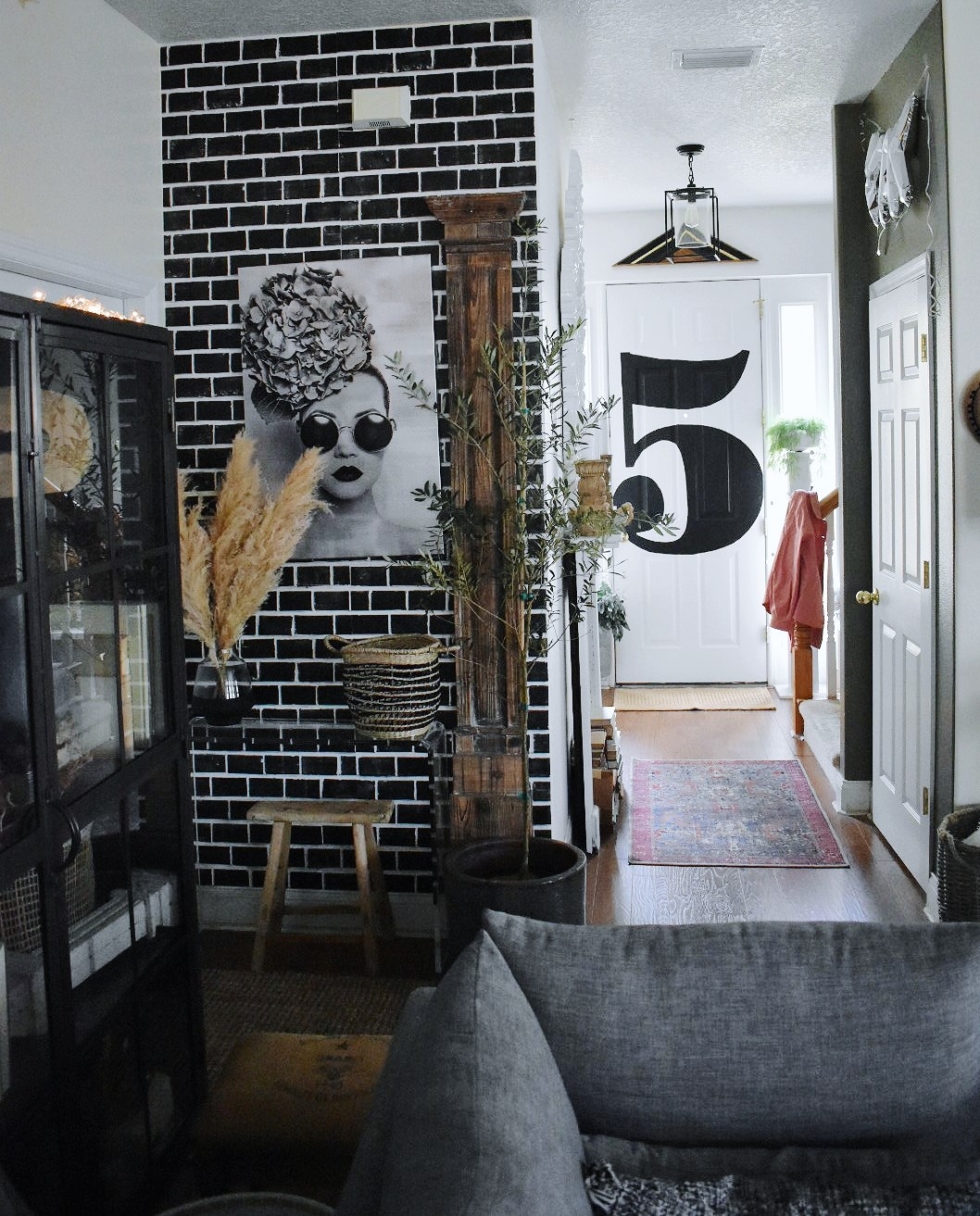
So I had a design dilemma and I’m sure I’m not the only one who has had this problem. I had a space, or spaces as you will see, that just weren’t connecting as far as style. Since they were all within view of each other I wanted them to feel more cohesive. Come see what I did!
Proud to have partnered with At Home on this Post.
With the help of my friends from At Home I was able to find the perfect pieces, and all under one roof! You have to love One Stop Shopping! I wasn’t even sure what I was looking for yet, but I knew whatever I needed…they would have it. So the space that was causing the sleepless nights and chocolate binging, was our foyer/side entrance/meets family room! Ok, before we go on let me just say…the chocolate was totally necessary and should be the first thing you reach for in any design dilemma. 😉
The three areas were so close together but didn’t really compliment each other. I decided to unite them, and to do so I realized I needed to add Texture, Decor, and Stylish Elements in complimentary tones.
Mirrors and Wall Art
One of the first pieces I got from At Home, was this incredibly gorgeous mirror. While it’s ornate in style, the bright white color keeps it clean and simple. The extra large size makes the foyer look so much bigger.
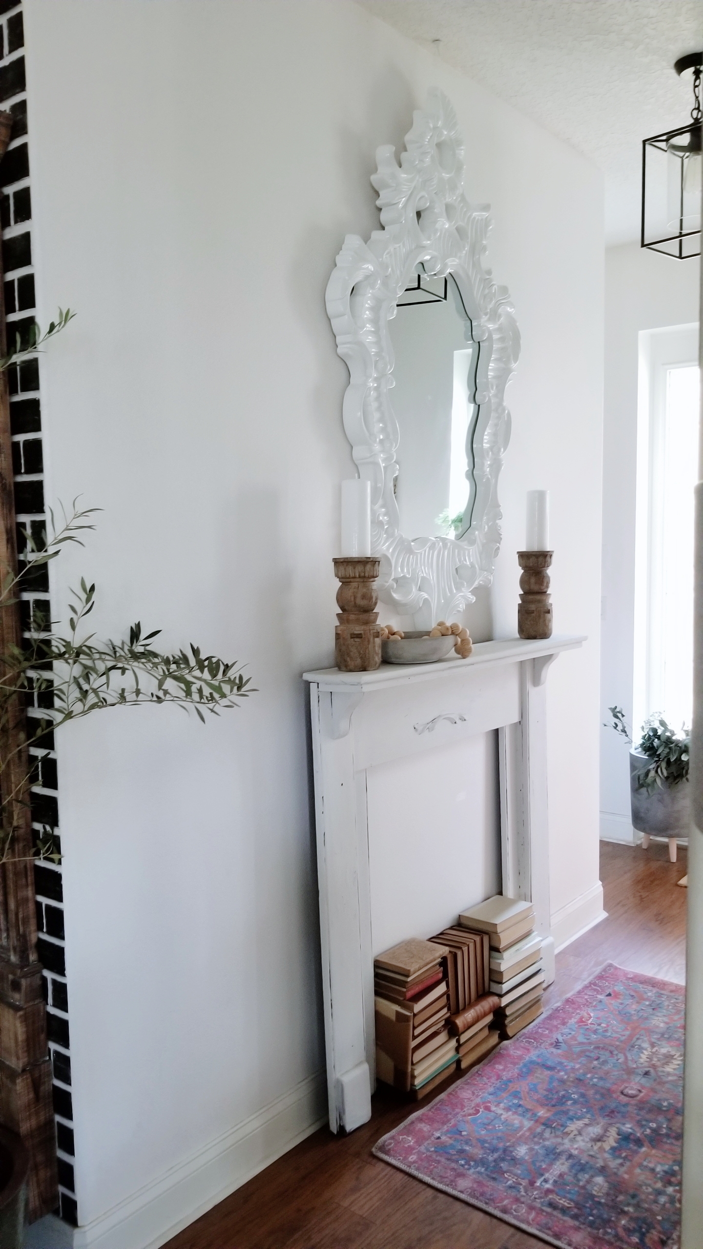
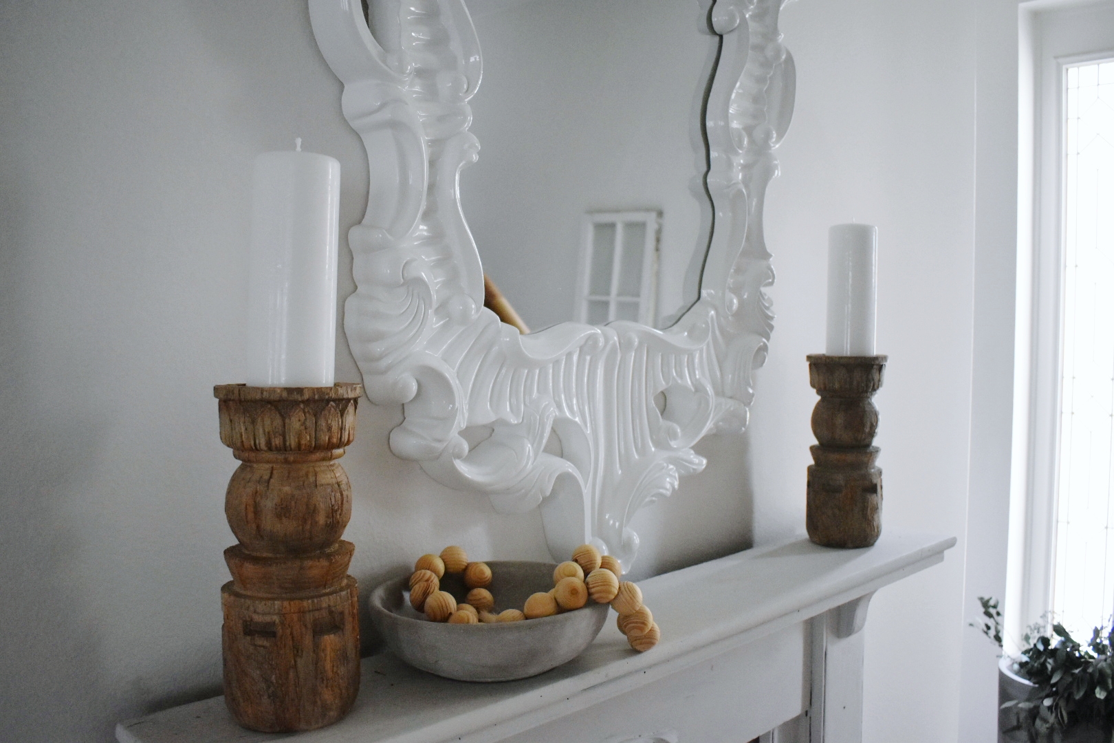
Having a mirror in the foyer is a great idea because it adds light to a typically narrow space and it’s always nice to double check your face and hair before walking out the door!
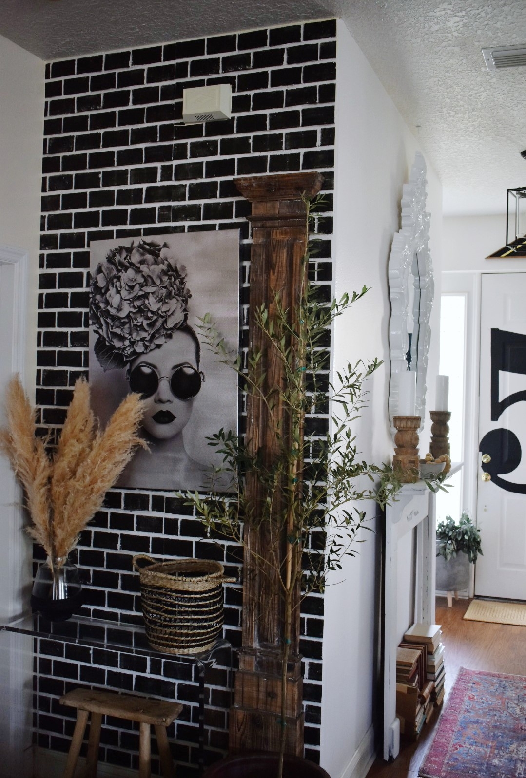
Because I love Art so much and I already had my black brick accent wall here, something simple but dramatic was on the list. At Home has aisles and aisles of wall decor. Finding the right one was the challenge. When I stumbled upon this one, I was hooked. It had drama, it had whimsy and it flowed with the white and black decor already in the space.
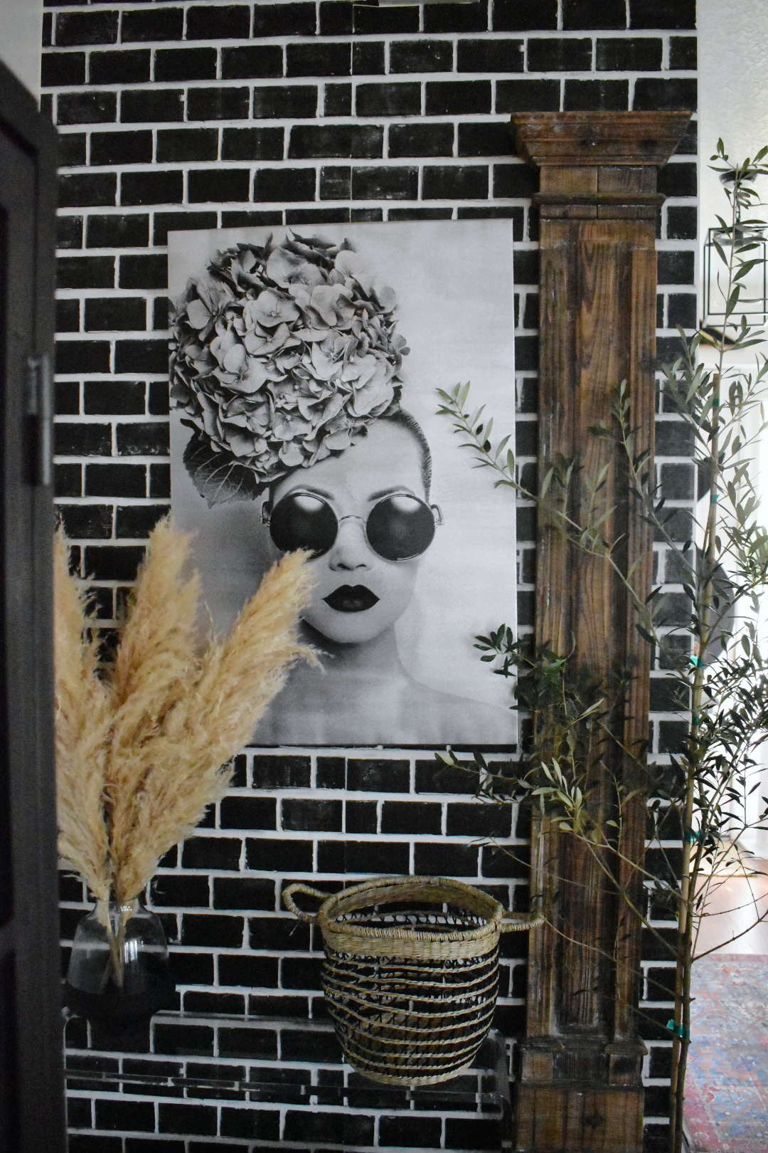
We decided to call her Lola. She was a hit when I brought her home!
Tip…Rather than adding lots of small pieces of art to a wall, try adding one large piece for more impact and to make the space feel larger.
Textures Are Everything!
I’m naturally drawn to more neutral decor, with pops of color. To unite this space though I needed to add lots of neutrals in repeated textures. For me, that meant jute, concrete and wood pieces.
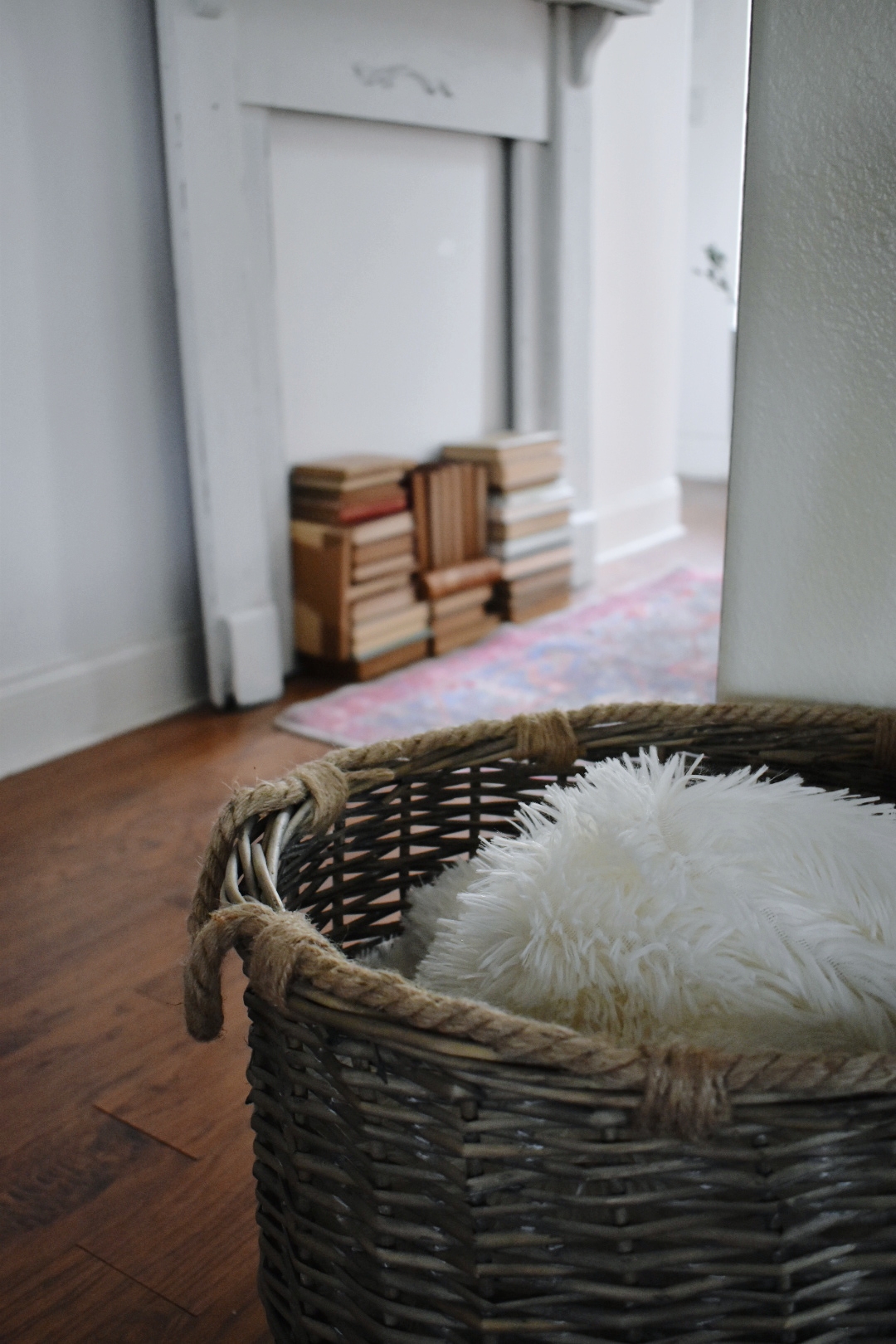
Again, I shopped the aisles of At Home and found everything I needed.
I found baskets with similar tones and not only jute but touches of black, tying back to the brick wall.
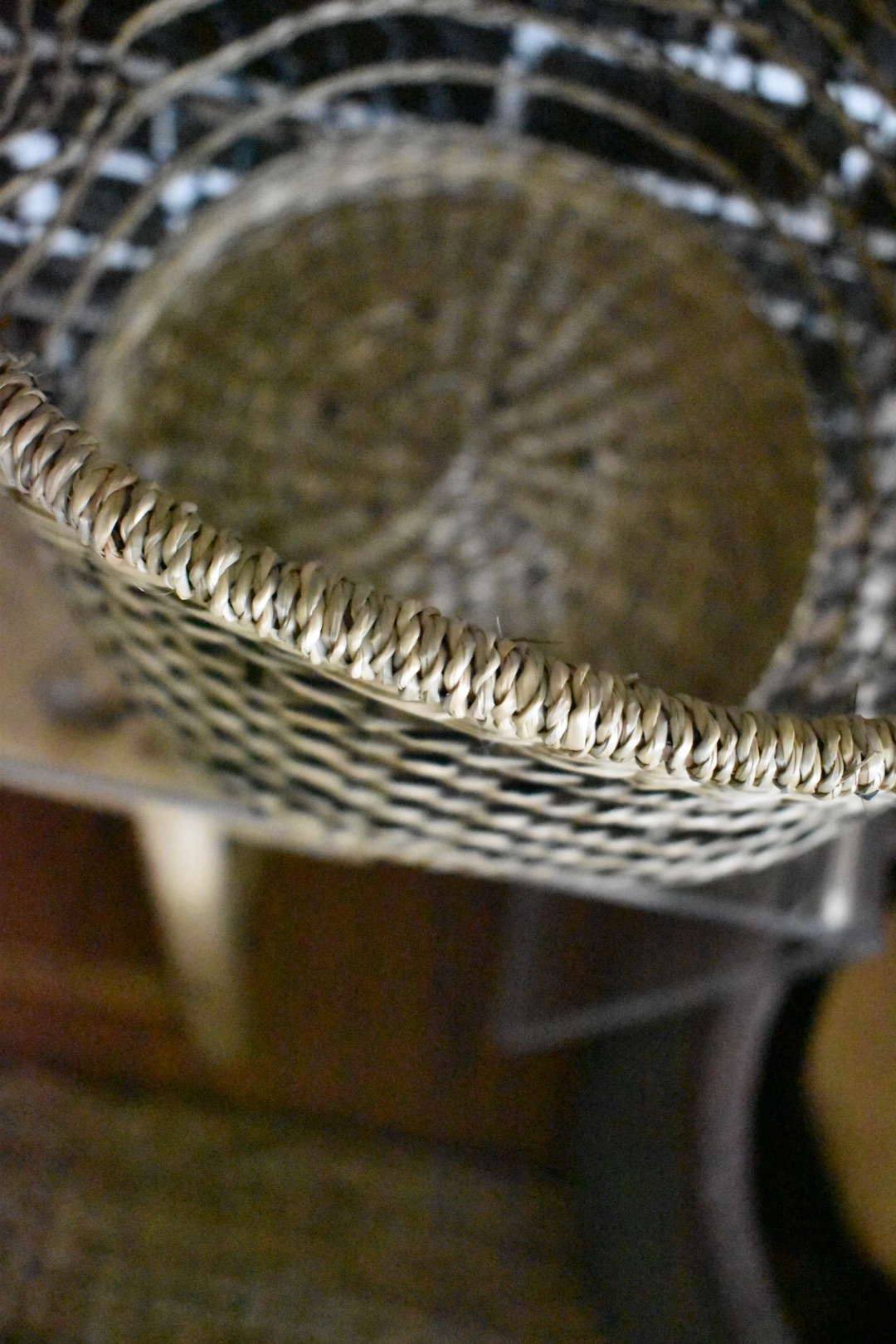
Every repeat of this texture helped the space come together more and more.
I found these rustic looking candleholders that look like chippy wood, but they are actually resin. I loved the detail and the wood tones.
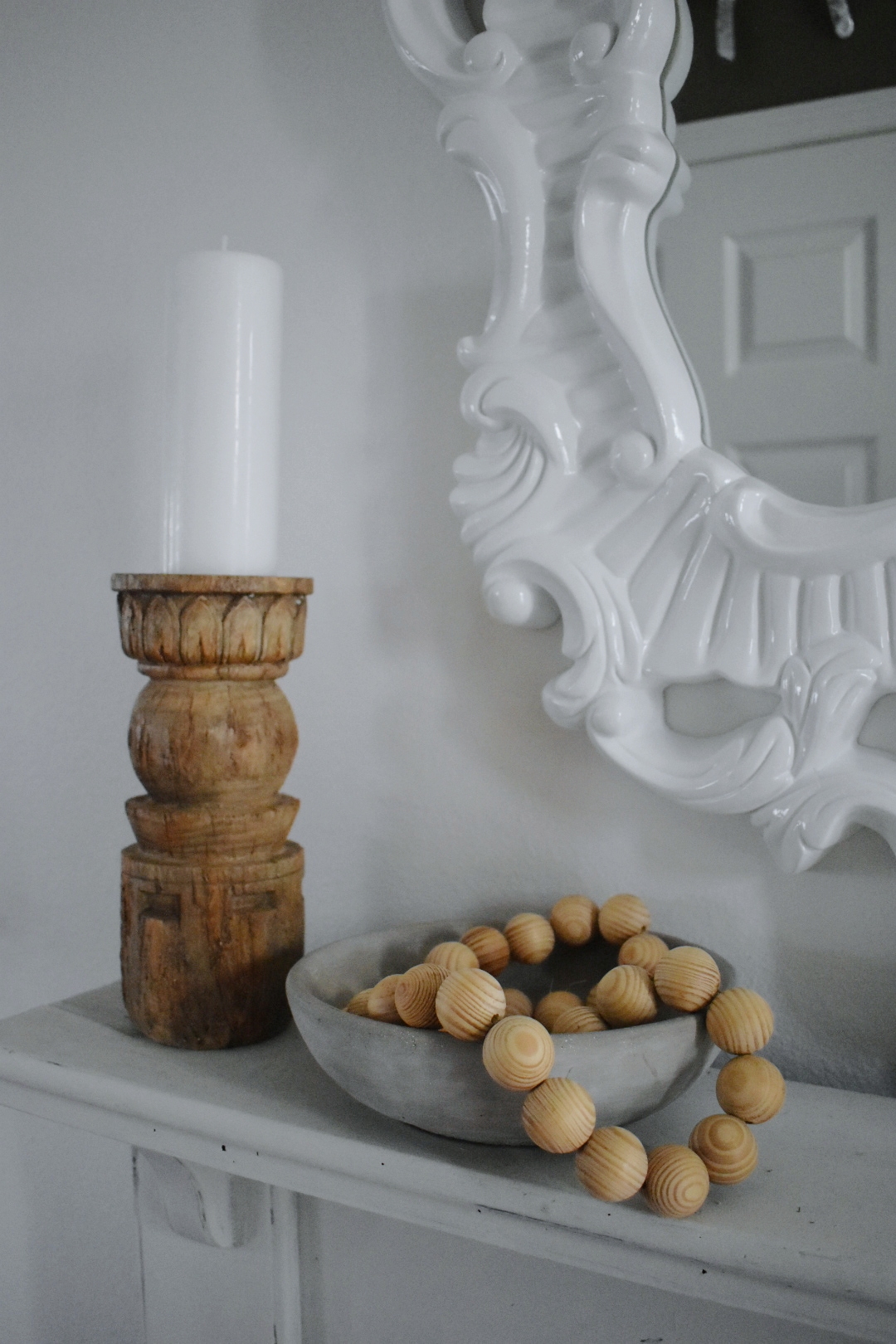
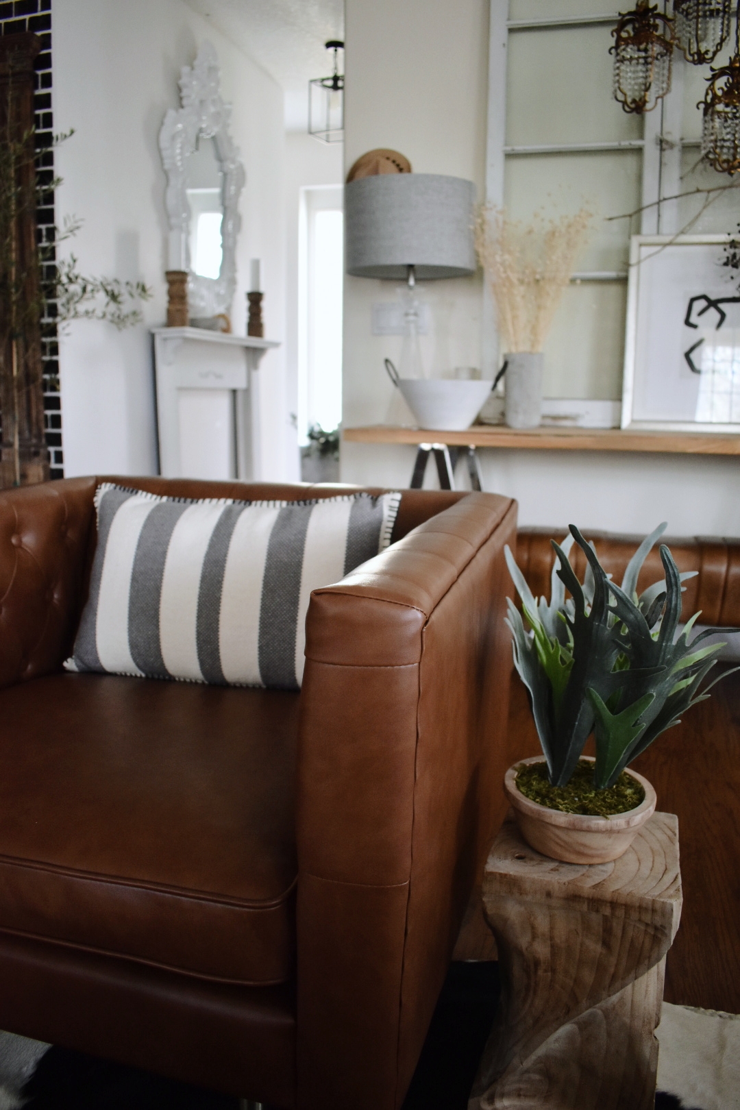
If you like the natural raw wood pieces that are so popular these days, At Home has those too. I found the perfect side table to tie in more wood tones.
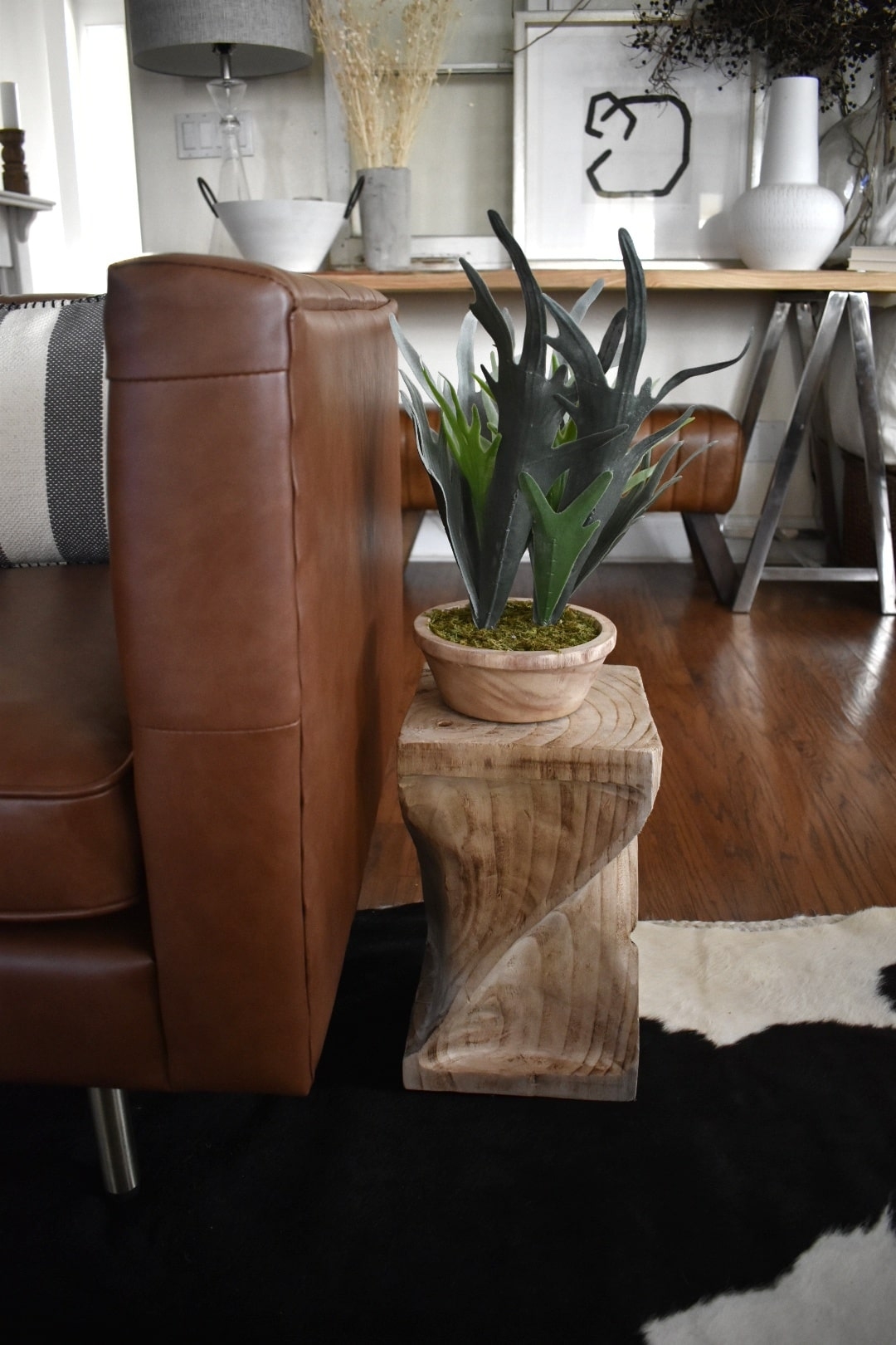
I grabbed a few concrete pieces and sprinkled them around the space. At Home has a wide variety of faux florals both silk and dried. I added these dried stems for the perfect organic element. Are you seeing the pattern?
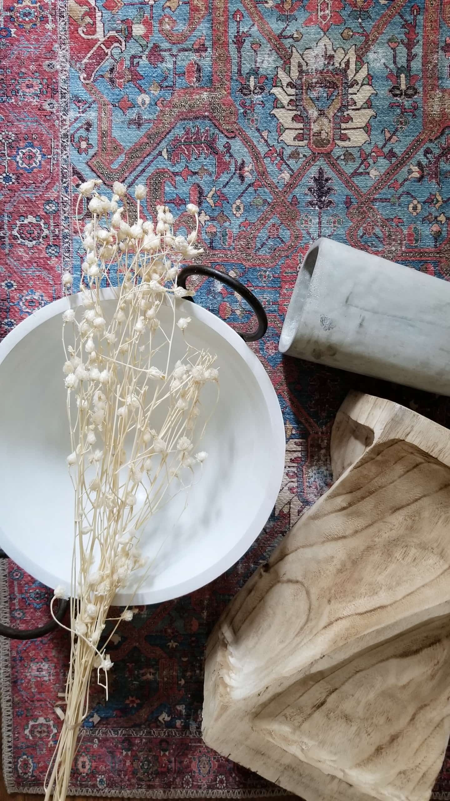
I added that white wood bowl with iron handles as a catch-all and it fit so perfectly with the theme I have going on.
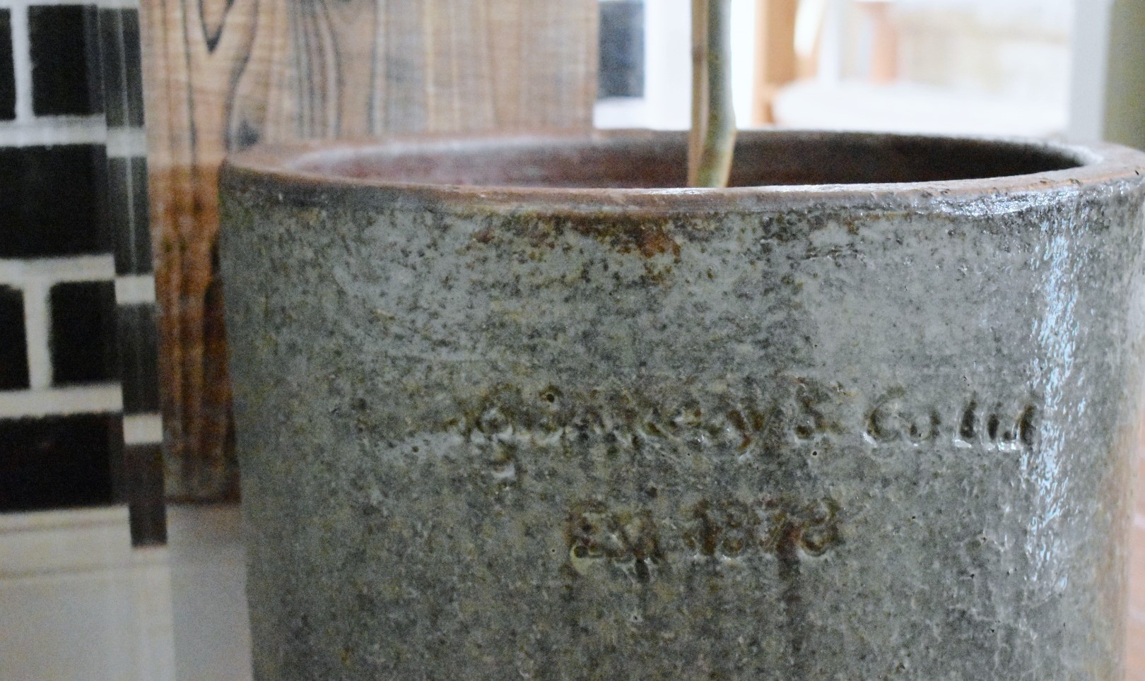
They also have the best selection of Pots and Planters year round and I had my eye on this glazed piece with detailed writing. The little details add up.
At Home has a huge selection of glassware, vases, and pottery. I wanted something to hold my pampas grass and when I spotted this black dipped vase, I knew it would be perfect. Just what I needed right here in the side entry.
Color and Comfort
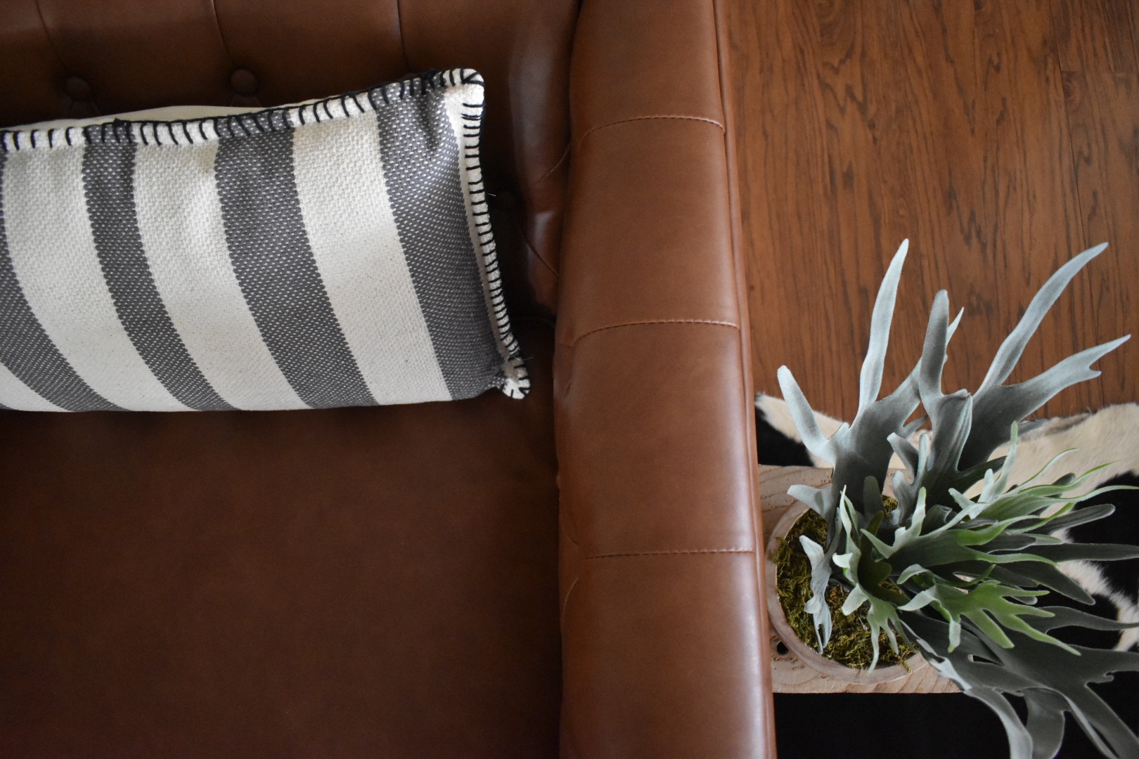
In keeping with not just the look but the purpose of this space, I added some color and comfort. I’ve been needing a bigger chair for the Family Room and since it is also “in view” of this troublesome corner I wanted it to help tie the spaces together. I found THE PERFECT chair! It is comfy and just the right size and the subtle camel color is both warm and neutral at the same time. It blends so well with the wood tones and accessories going on around it. This style is so popular right now and the price was ridiculously good!
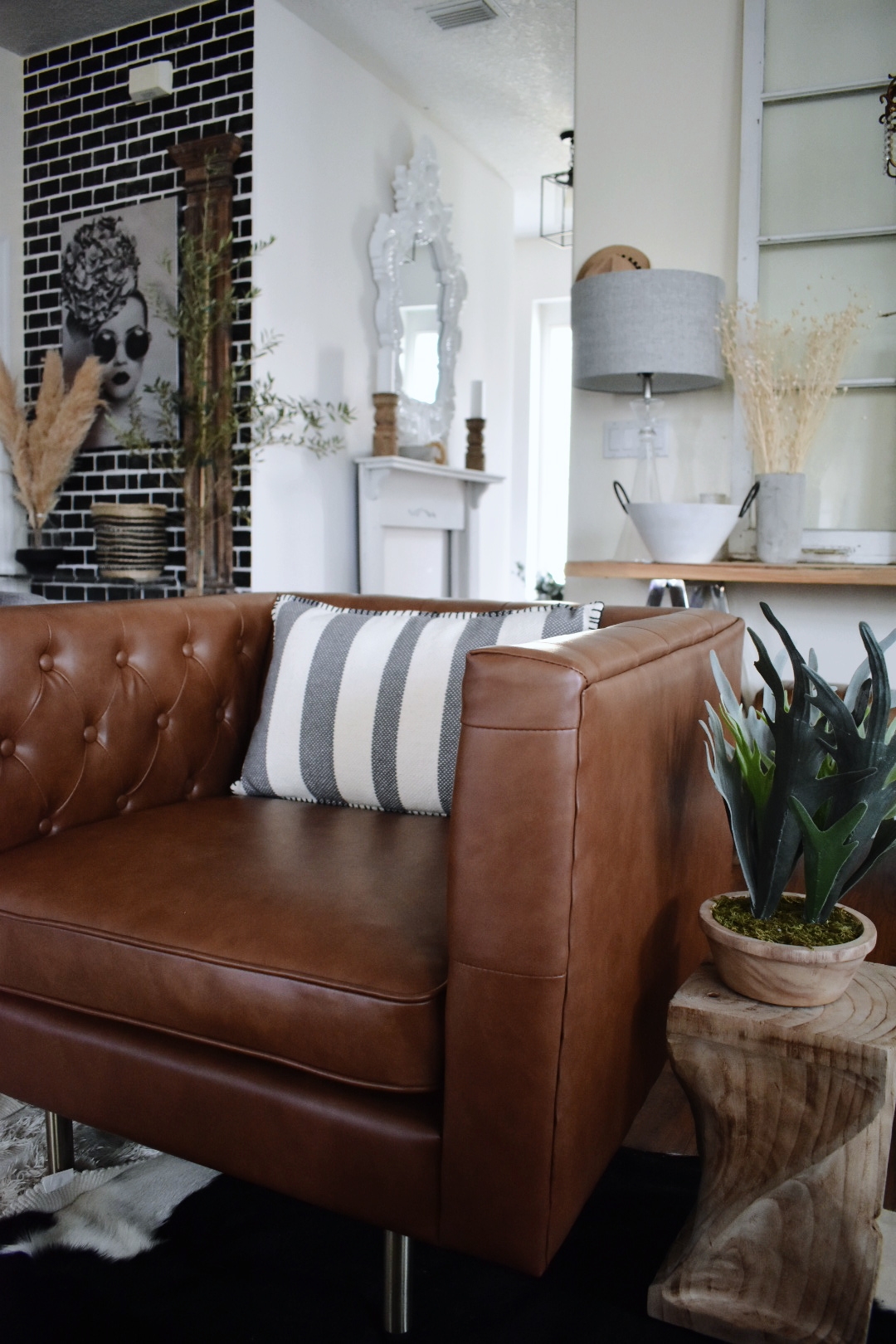
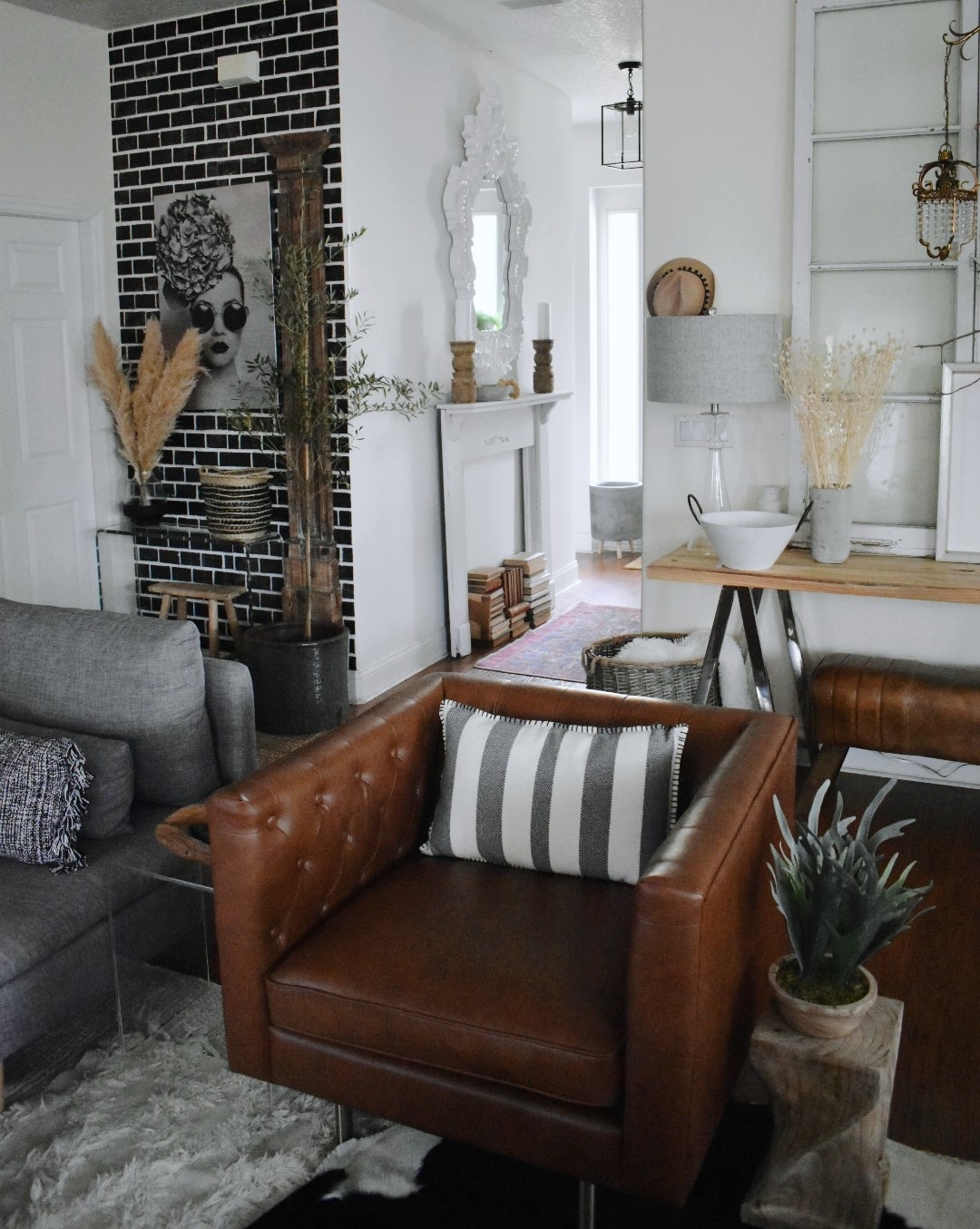
To add to the warmth of the camel color and add some more style, I added a vintage style accent rug near the mantel. I added one long jute rug with fringed edges by the side entry and a smaller jute rug by the front door. At Home has such an amazing selection of rugs, you can easily find whatever style and size you are looking for. Again, repeating colors, textures and styles is the answer!

I also made some small changes, like swapping my burlap lampshade out for a bigger gray one. It ties in with the concrete accents, had a little more modern touch and was an easy and affordable change. I also found the perfect accent pillow, with gray stripes and lots of texture.

So there you have it! My design dilemma is a dilemma no more! Instead, it’s one of my favorite views. It’s stylish, cohesive and comfortable. If you have an area that needs help, I hope my tips can help you. And if you’re looking for the perfect piece of wall art, furniture, decor or maybe just a rug…go to At Home…I promise you they will have it! All the pieces I mentioned were found at my local At Home Store. Thanks for following along. Join me on Instagram, Facebook, and Pinterest where I’ll be sharing more photos and ideas. Also, sign up to follow me here on the Blog so you don’t miss what I do next! A big Thank You to At Home for making My Home even better!
See you soon!

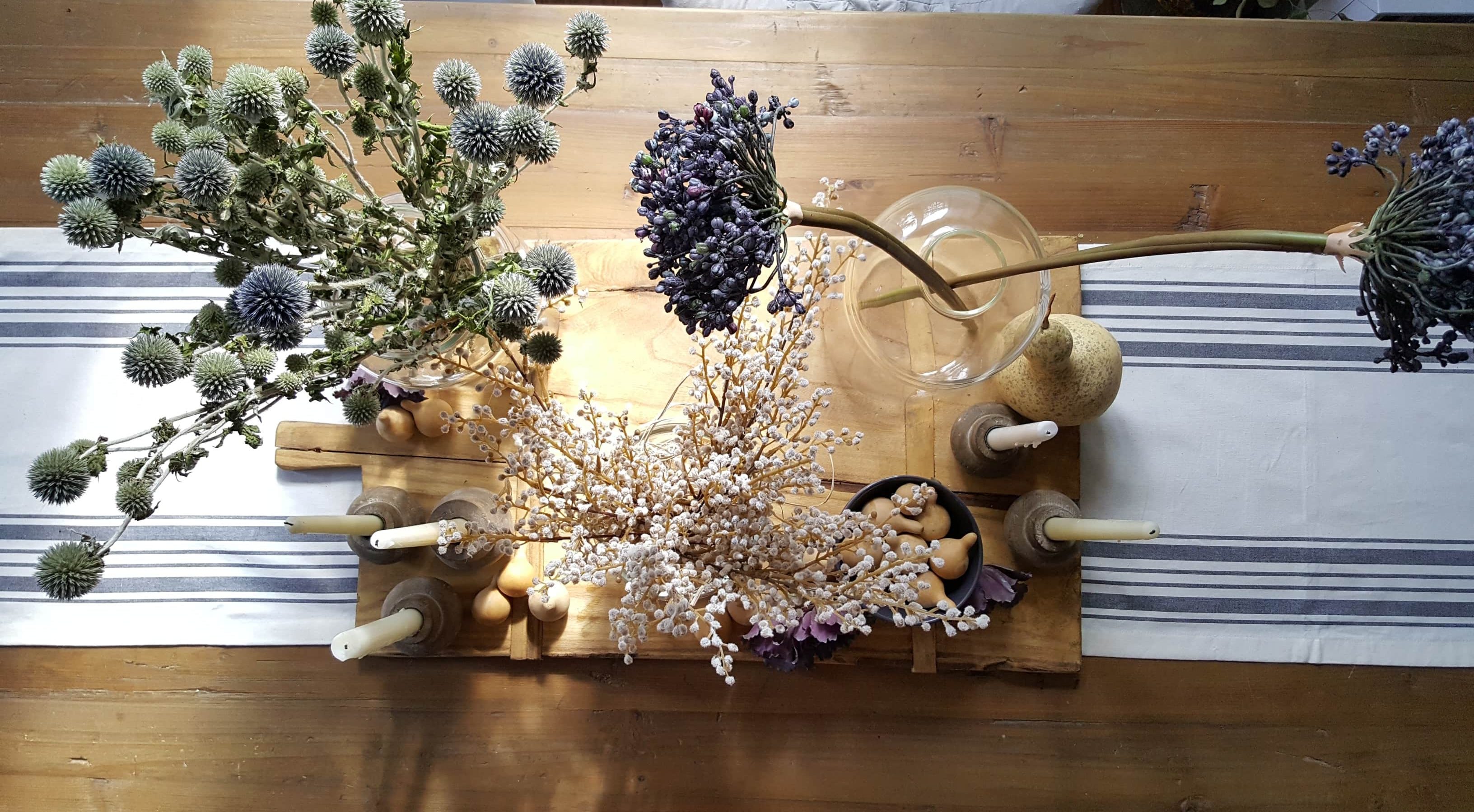 Using Faux Flowers in Your Fall and Winter Decor
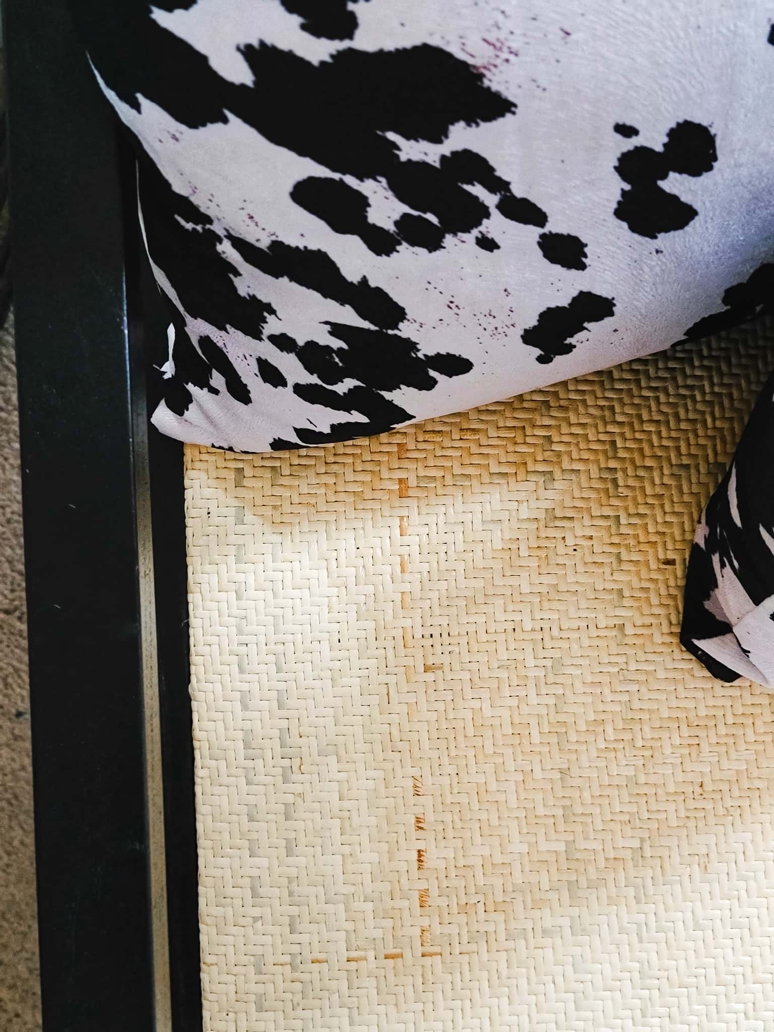 Wall Decor and Bedroom Accessories with Joss & Main
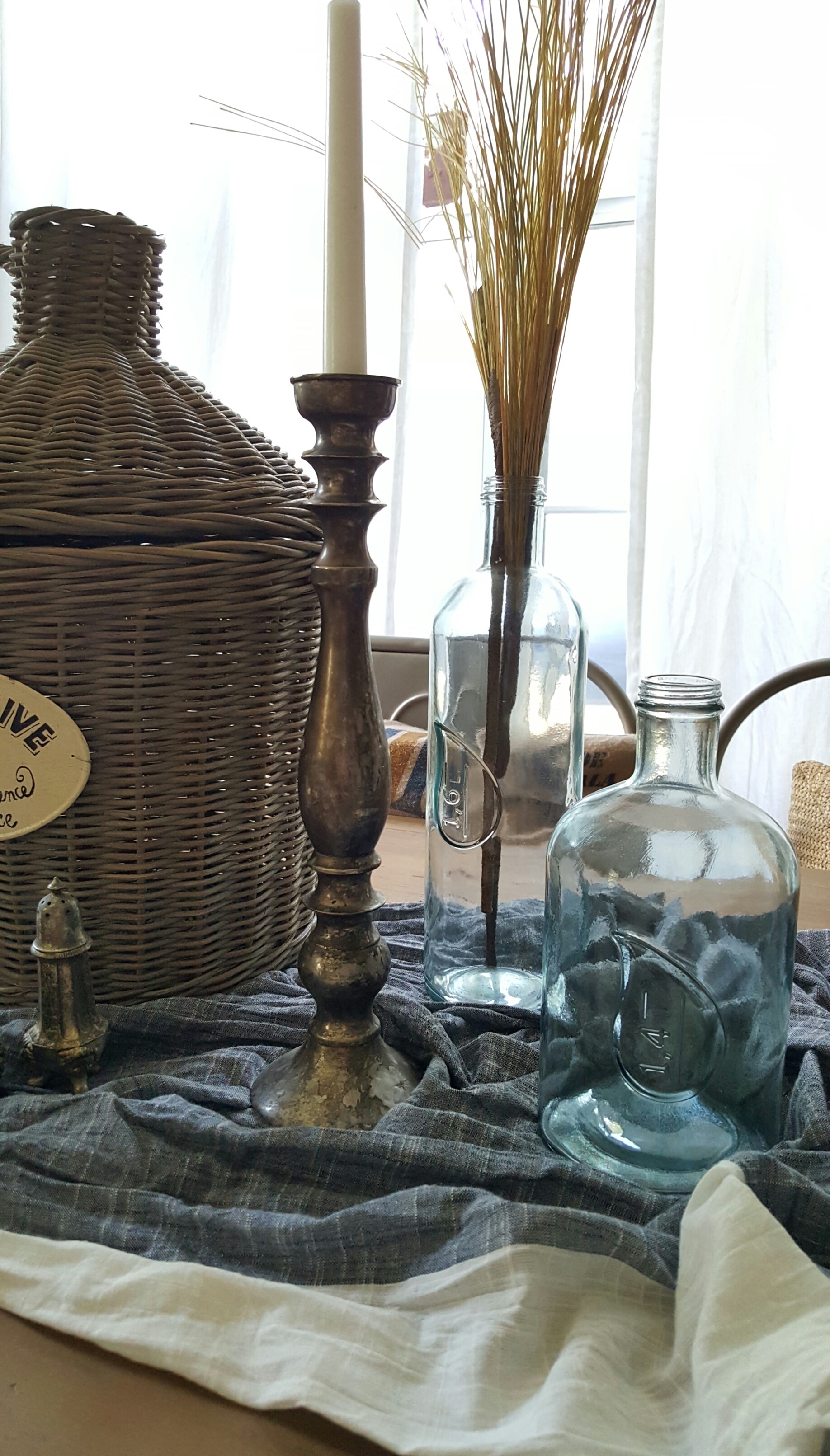 Shop The House Design Challenge – Fall Edition, Week 2

I love all of this!
I’m so happy you like it Darla! Thanks so much!
Looking good!!!
Thank you Cherri! I appreciate the compliment!
Looks wonderful!!!
Thank you so much Karen!! I really appreciate that!